Is Neutrality Becoming The New Trend In Fashion As An Expression Of Grounded Luxury?

A chromatic focus on contemporary designers’ proposals, between history and psychology
No doubt colors come in and out of fashion. Fashion is like a dynamic realm: constantly evolving and reflecting the times. Actually, colors in fashion are not just about aesthetics: they convey messages, reflect societal shifts and often mirror the cultural “zeitgeist”, the spirit characterizing an epoch, as reflected in literature, philosophy, arts and, of course, fashion. Throughout history, colors have cycled in and out of vogue, influenced by various eras, decades, and historical events, which have always played a crucial role in shaping color trends.
In the “roaring” 1920s, for instance, fashion embraced bold and vibrant colors, representing the exuberance and liberation of the post-war period. The 1950s and 1960s, the decades following the gloomy years of World War II, saw a similar explosion of color, the former showing delicate pastel shades, as a symbol of peace and optimism, the latter with psychedelic patterns and bright hues, symbolizing the era’s spirit of rebellion and change.
Conversely, the Great Depression of the 1930s, on the aftermath of Wall Street Stock Market crash in 1929, saw a preference for more subdued and modest colors, reflecting the economic hardships of the time. Interesting to know that the iconic “Schiaparelli Pink”, a vibrant shade of fuchsia, was launched by the homonymous Maison exactly in this period, as a hint of optimism in contrast with the dark years of the “entre deux guerres”.
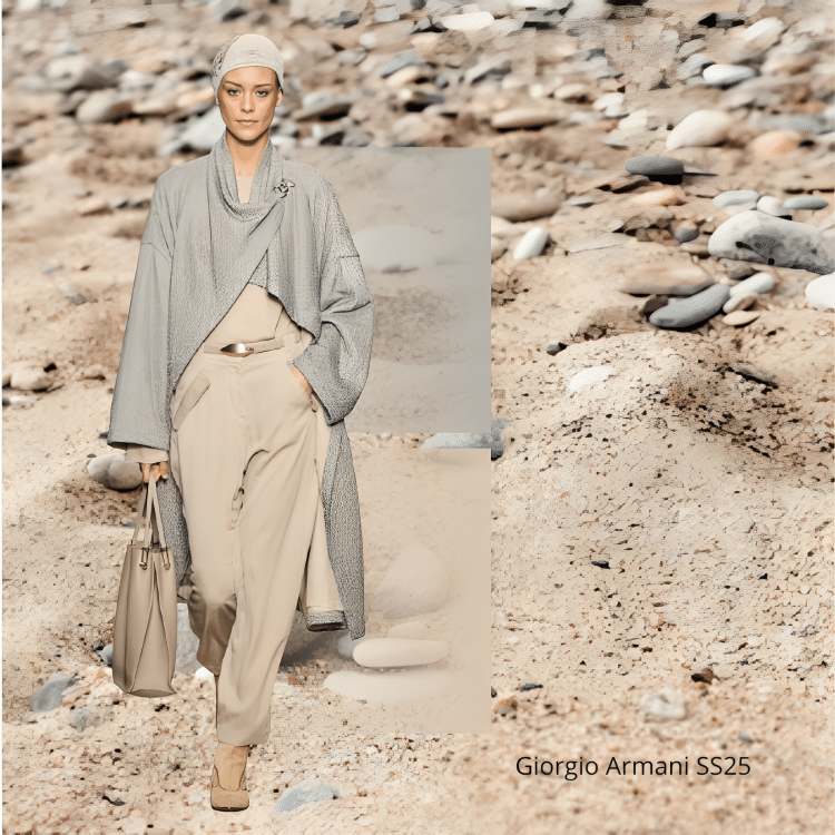
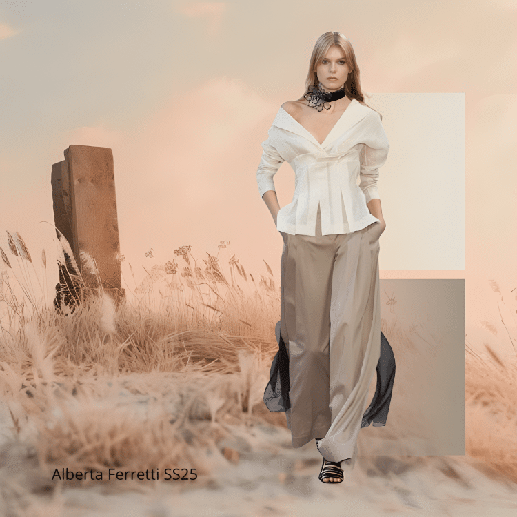
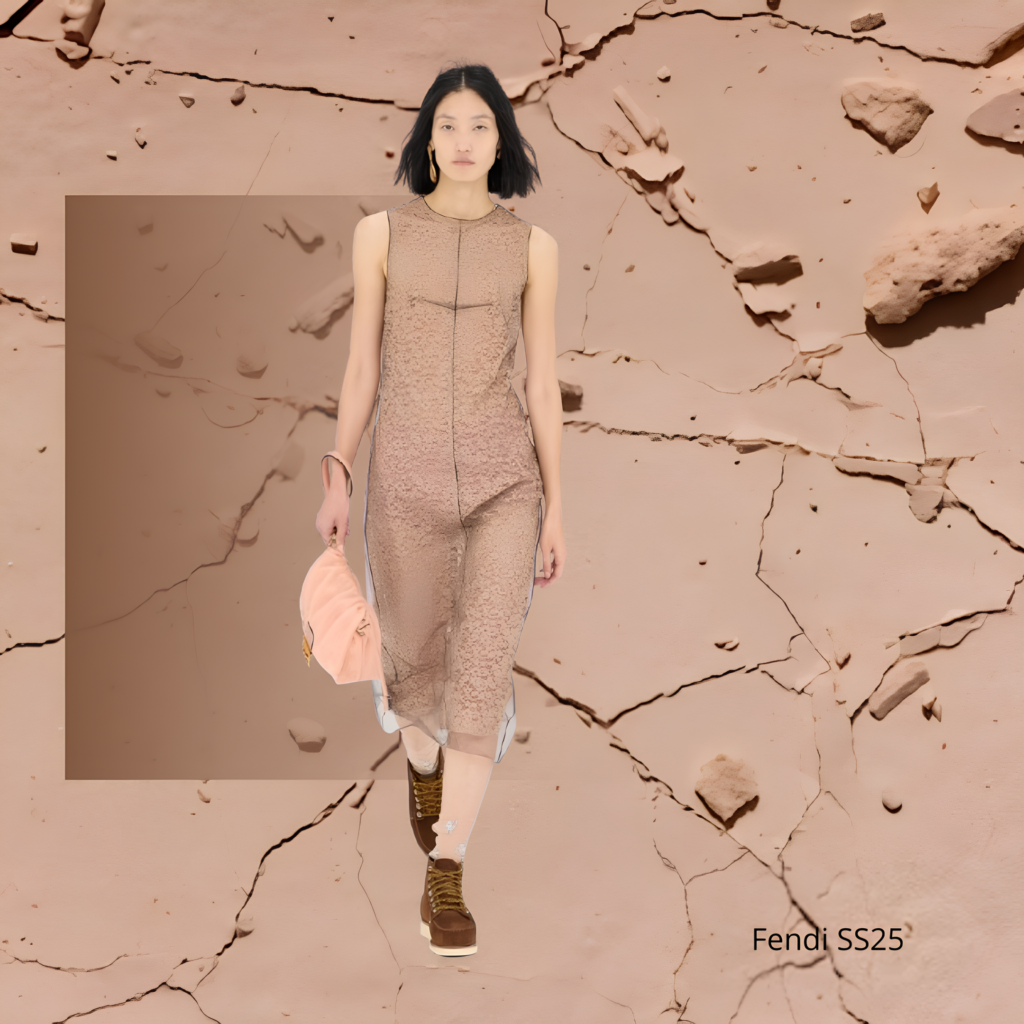
Neutrality Tone Layouts & Design by Dr. Manuela Pirola; Image Source: Vogue
Also the 1940s were dominated by muted tones. The austerity of World War II, as mentioned, influenced fashion, with darker shades like navy, black and brown becoming prominent as they conveyed a sense of practicality and resourcefulness. The 1980s, on the other hand, were marked by excess and boldness, with neon and metallic colors epitomizing the decade’s flamboyant style.
In more recent times, the world of fashion witnessed an explosion of color soon after the “grayness” of the global pandemic of 2020. Designers came out with collections featuring fiery tones, rather than vibrant shades of yellow, green and blue. Colorful garments acted as shields buffering against the impact of the traumatic experience of Covid-19, which had brought about feelings of distress, anxiety and depression. Maison Valentino (whose name was already linked to the iconic “Valentino Red”) launched PP Pink (aka Pierpaolo Piccioli Pink, after the name of the then creative director of the fashion house), an audacious shade of pink destined to become synonymous of love, community, energy and freedom.
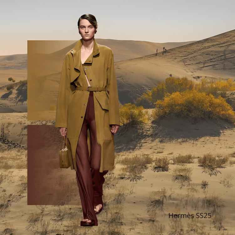
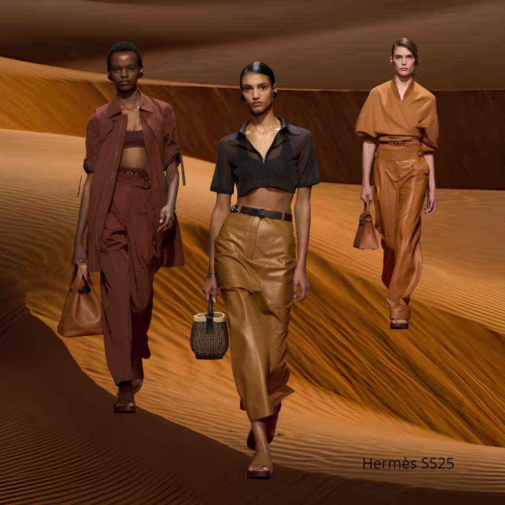
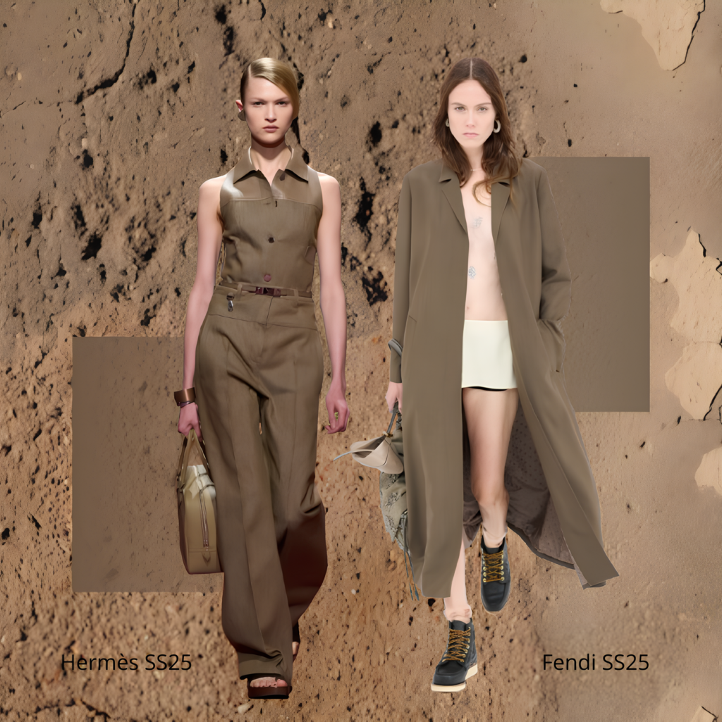
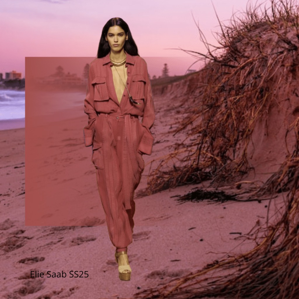
Neutrality Tone Layouts & Design by Dr. Manuela Pirola; Image Source: Vogue
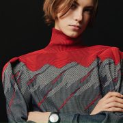
September, however, has given us a preview of the trending colors for the Spring/Summer 2025 season (thanks to the collections showcased during New York, London, Milan and Paris Fashion Weeks) and the chromatic approach seems to lead, once again, to a rise in popularity for neutral shades and tawny tones. As a matter of fact, alongside a respectable range of saturated and dynamic hues, which – according to the forecast – will be making a statement during Spring/Summer 2025 (by the way, you can find all details about it in Gazetta’s October issue), we will also find more classic colors bringing balance, such as sandy beiges, creams, a variety of taupe tones, muted grays, elegant greige (a delicate hue blending gray and beige, widely used by Armani), browns and khaki (a greenish nuance, whose name derives from the Persian word “khak” meaning “earth”). Pastels also will definitely have a moment with baby pinks, minty greens and buttery yellows adding a delicate touch to many collections. These color trends will offer a dynamic palette reflecting both bold creativity and subtle natural influences.
Natural and earthy tones, in particular, are extremely versatile, timeless and exude an understated elegance and grounded luxury. They are easily adaptable to various looks, whether minimalist, chic or sophisticated. Metaphorically speaking, they act as a blank canvas for creativity, setting the stage for endless possibilities in styling and accessorizing. The appeal of neutrals can also be attributed to their ability to transcend seasons and trends. In a world where sustainability is becoming increasingly important, neutral colors embrace this ethos and provide a solution by offering longevity in fashion pieces, within a broader cultural shift towards simplicity and mindfulness.
Neutral colours, in fashion, are usually associated with the use of raw materials and organic fibers, mainly cotton, linen, hemp, silk and wool and their desaturation tends to highlight the structure of the garment, shifting the attention to its texture and overall design.
But, again, colors in fashion are not just a visual delight. From a psychological point of view, in fact, neutral and tawny shades conjure a sense of calmness and stability (the same deriving from closeness to Nature) and provide a respite from the uncertainty of the world outside. No surprise, then, that these colors are gaining significant traction in contemporary fashion, reflecting the crazy scenario around us. The recent inclination towards neutral shades highlights the desire and need for pausing and breathing and suggests that, in a fast-paced society, where humans are losing themselves, simplicity is the key and it is likely to keep on playing a pivotal role in shaping the fashion narratives of tomorrow.
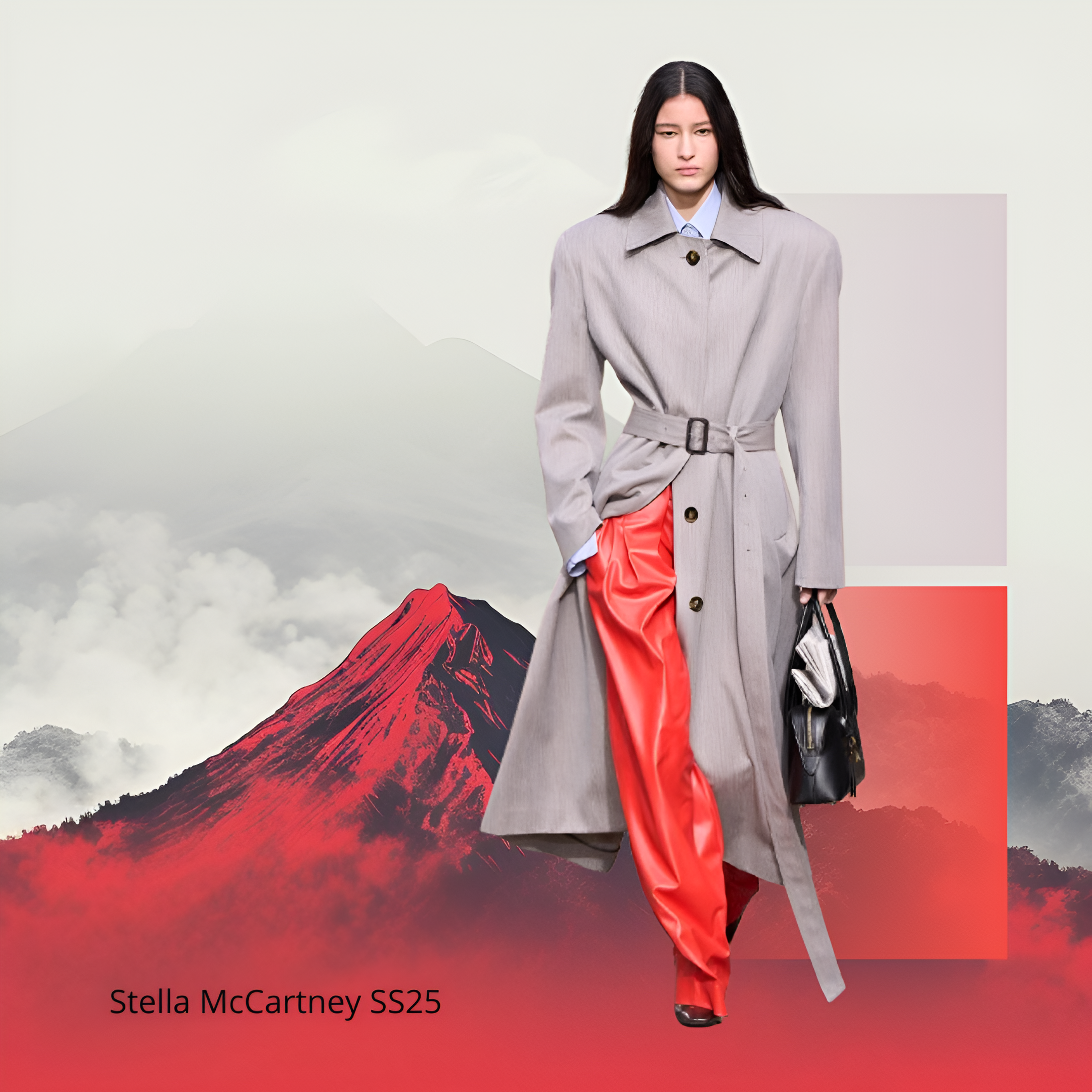
In this perspective, alongside the brands which have always made neutral colors the hallmark of their aesthetics (like Armani, Max Mara, Jil Sander to mention a few), we can also find plenty of designers willing to embrace minimalism as a form of understated luxury, through an extensive use of natural shades, alone or in combination with a pop of color (Stella McCartney can be an example), maybe wanting to mirror the dualism characterising the contemporary world, a mix of restlessness and desire for calmness.
Pantone as well, whose “Color of the Year” is essentially a chromatic snapshot of what is taking place globally and what is reoccurring in everyday life, seems to be following this tension towards neutrality: Pantone proclaimed “Peach Fuzz” as Color of the Year 2024, a light, soft, fruity tone evoking feelings of peace and serenity, a nurturing shade soothing the turmoil in our life. Peach Fuzz is actually far away from the bolder “Viva Magenta” of the previous year and from the vibrant “Illuminating Yellow” as Color of the Year 2021, this latter representing, together with “Ultimate Gray”, respectively the renaissance of the world after the shock of the Pandemic.
Will Pantone confirm the same trend this year or will they rather re-write the rules? We will know next month, when Color of the Year 2025 will be finally unveiled.


