When Color Refuses to Behave
On a screen, color is well behaved. Code, name, square, done.
Out in the wild, it is not that polite. It shows up in a chord, sneaks out of a window at night, clings to an artist for decades like a smell in a coat. It edits mood before language catches up. It does not care about your palette document.
That is the version of color I am interested in. Not “what is your favorite shade,” but: what is this actually doing to your body, your memory, your work.
Take music.
French composer Olivier Messiaen used to say he saw colors when he heard sounds, not with his eyes but in his head. Certain harmonies arrived already dressed. He did not just write chords. He wrote “yellow topaz,” “bright green,” “blue-orange chords” into his scores for works like Couleurs de la cité céleste and Quartet for the End of Time. For him, music without color was the problem.

Image Source : Wikipedia
He also said that if you took the same sound up an octave, the inner color grew paler, and if you dropped it lower, it darkened. Only when you changed the harmony itself did the color really shift. That is not metaphor. That is someone describing a system they live inside.
You do not need chromesthesia to know what he is talking about. You put the right track on in a taxi and the whole street shades differently. The sky stays the same, but the city feels cooler, or heavier, or wired. You might not call it “blue orange,” but you know the atmosphere just changed.
Now imagine walking into a room with that in mind. The walls are painted that safe off-white the industry keeps renaming every season. Cloud, milk, fog, bone. Under morning light it feels gentle. Under office LEDs it goes chalky. Outside, under a sodium street lamp, it turns into tired plaster.
If Messiaen walked in, he would not ask for the Pantone code. He would ask what chord this is. A slow unresolved piano line. A drone that never gives you a break. A stack of bright notes that feels louder than the situation.
Once you think like that, “choosing a color” starts to feel a lot more like writing a playlist people are forced to live inside.
Then the sun clocks out and everything gets worse, and better.
American photographer Todd Hido has been driving through suburbs at night for years, photographing anonymous houses where the only drama is one or two lit windows. His Homes at Night and House Hunting images are all quiet façades, damp streets, and the glow of cheap bulbs leaking out into the dark.

Image Source : http://www.toddhido.com/
The color is doing the heavy lifting. Sodium street lamps drown whole roads in orange haze. Fluorescent kitchen strips turn curtains a flat institutional green. A television paints a yard in cold blue. Hido does not “fix” any of it. He lets the municipal lighting plan, bad wiring and all, write the palette. Critics call the work cinematic and uneasy, but what they are really feeling is how those colors turn a bland house into a story you will not fully trust.
If you have ever walked home after midnight, you know that code.
One corner makes your skin look healthy.
The next throws you into grey.
A neon sign hits snow and suddenly the whole street feels like a movie scene you did not audition for.
Daylight tells you what something is.
Night light tells you what it wants to be.
Yet we keep designing as if night is an afterthought. Collections shot at 10 a.m. Interiors planned for brunch light. Campaigns built for bright screens. Then reality happens in parking garages, metro platforms, side streets, back bars, Christmas markets, backyard parties where the only light is a string of LEDs and a fridge door.
What if you start from that instead.
You ask what your color does under the worst possible bulb. You test fabrics in pharmacy green, in petrol station turquoise, in the dirty amber of an old street lamp. You think about reflective details not as a safety feature but as a plot twist when a car turns the corner. You accept that neon and fluorescence are not the enemy. They are uncredited collaborators who will get their hands on your work whether you like it or not.
Night is where color stops behaving and starts telling the truth.
Then there is the slow burn. The color that will not move out, no matter how often you repaint.
Lebanese-American poet and painter Etel Adnan built small canvases that hit like weather reports for a very specific inner climate. Blocks of red, yellow, blue, a sun as a hard circle, a strip of sea or hill. She painted Mount Tamalpais in California again and again, but critics and curators keep pointing out how those same bands of color also carry the light of Beirut, the Mediterranean, the multiple geographies she lived between.
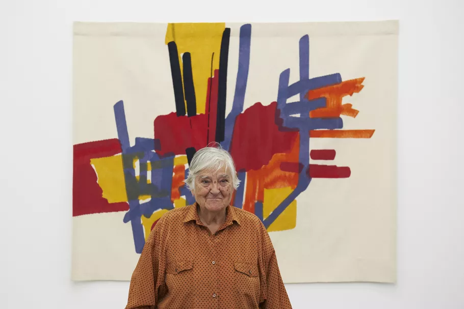
Photo by Patrick Dandy. Courtesy of White Cube.
Her work is not chasing the Pantone of the year. It is answering to a certain sun and a certain horizon that refused to leave her alone.

Danish-Icelandic artist Olafur Eliasson talks about growing up in Iceland in the seventies, where electricity was sometimes rationed. At certain hours the power simply cut. The only light came from the sky, snow, reflections. Those evenings, the room changed without anyone touching a switch. People moved closer. Time slowed. Light suddenly felt like a shared resource, not a background setting.

Image Source : Dezeen
Fast forward: he is making huge artificial suns in museums and co-creating Little Sun, a small solar lamp described as “a work of art that works in life,” built to bring clean, affordable light to off-grid communities. The same question is still there: how does light shape the way we live together, and who gets to have it.
In both cases, color is not decoration. It is biography and infrastructure. It is a record of where someone stood, what sky they grew up under, which blackout taught them something about how people gather.
Most of us are not hanging shows at White Cube or installing suns at Tate, but we are not exempt.
There is one green from a bus seat or classroom wall that keeps coming back in your apartments.
There is a blue from a school notebook, a pool, a basin in your grandmother’s courtyard that keeps sneaking into clothes, packaging, feeds.
There is a brown from a particular staircase, a café, a family table that ends up in every “neutral” you pick.
Image Source : https://olafureliasson.net/
You think you are making a neutral choice. Your history is choosing for you.
So what do you do with color when it refuses to behave.
You stop pretending it is neutral and start treating it like a character that has been in the room longer than you. You ask what chord it would be if you played it. You pay attention to what it turns into at 9 p.m. under some unforgiving light. You notice which shade keeps following you from project to project and you admit that it is not an accident.
If you stripped your wardrobe, your camera roll, your apartment, and your work down to the bone and laid everything out on the floor, one color would still insist on being there after the trend shades had left.
That is the one telling the real story.
The one you have been scoring, walking through, and working with all along, whether you meant to or not.
