The Hues of Autumn and Winter at NYFW
Walking the showrooms and runways, these Pantone colors told a story of contrast, depth, and wearable expression for the season ahead.
Walking the showrooms and presentations during New York Fashion Week, the city felt electric, alive with color, texture, and energy. The dualities of autumn and winter were everywhere, from muted, mineral-inspired neutrals to rich, jewel-like tones that popped against concrete and steel. Being in these rooms, I could see exactly what Pantone highlighted in its Autumn/Winter 2026/2027 report. These were not just swatches on a page but fully realized in fabric, silhouette, and styling. (Source: Diary Directory)
Pantone’s seasonal palette confidently blends earth-rooted warmth with vibrant accents. At its heart are grounded tones like Muted Clay, a warm terracotta that feels like worn leather, and Arabian Spice, a raw brown with a primal connection to nature. Burnt Olive and Neptune Green bring depth and organic richness, while jewel-leaning hues like Red Mahogany and Festival Fuchsia infuse energy and personality. Brighter notes such as Acacia, with its green-infused yellow optimism, and All Aboard, a maritime blue, provide contrast and surprise. To balance it all, seasonless neutrals like Egret creamy white, Toffee chocolate brown, and Underworld mid-tone grey offer calm and structure. (Source: Diary Directory)
Image Source : Pantone Press Office
In Norma Kamali’s FW 2026 collection, the colors felt familiar yet reimagined. Layered knits in toasted almond and graphite were accented with deep forest greens that echoed Neptune Green and Burnt Olive from the Pantone palette. These hues created warmth that still read modern and sophisticated. The simplicity of silhouette allowed the colors to speak, particularly when a Muted Clay tone appeared against a backdrop of grounded neutrals. It felt like an intentional nod to the season’s earthy mood.
Image Source : Pantone Press Office
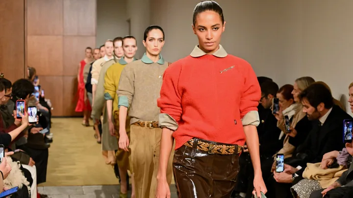
Esé Azénabor’s Fall 2026 Eveningwear Collection showcased the jewel tones in their most dramatic form. Sapphire-adorned gowns, rich ruby accents, and bold violet elements highlighted the intensity of Red Mahogany and Festival Fuchsia. Against softer supporting tones, these vibrant colors seemed to illuminate the space, creating movement and emotion in every walk of the model. Textures played as much of a role as the colors themselves. Silk, satin, and velvet caught light in ways that echoed All Aboard’s depth and Acacia’s brightness. These combinations reflected the season’s narrative of contrast and expression. (Source: Diary Directory)
Image Source : Pantone Press Office
For those looking to bring these colors into their everyday wardrobe, start with a single standout piece in one of the key accent hues like festival pink or maritime blue, paired with neutral basics. Think a rich Red Mahogany coat or Neptune Green trousers with a calming Egret blouse. Layering remains essential, not just for warmth but to create dimension. Accessories in muted metallics or tonal prints can highlight the palette’s livelier notes without overwhelming. Consider grounding a look with Toffee or Underworld at the base, then let a bright tone shine through with intention. (Source: Diary Directory)
This season reminds us that color is more than decoration. From the grounded energy of the runways to the everyday streets of New York, Autumn/Winter 2026/2027 invites a balance of practicality and expression. These hues are not just worn. They become part of your story, your environment, your moment. (Source: Diary Directory)
