Saint Laurent, Heatstroke And The Art Of Actually Meaning It
I was not looking for another campaign to think about. Then Saint Laurent dropped this one, and suddenly everyone else’s ads started to look like stock images.
Under Anthony Vaccarello, the house has been doing this slow, confident tightening of its visual language. The Spring 26 collections already dial up that sharp, almost architectural silhouette he loves: shoulders that cut the air, long skirts that move like a sentence with no wasted words, leather that feels more like infrastructure than trend.
Source: Press Office
The new campaign sits inside that world and does something deceptively simple. It takes all that discipline and drops it into heat.
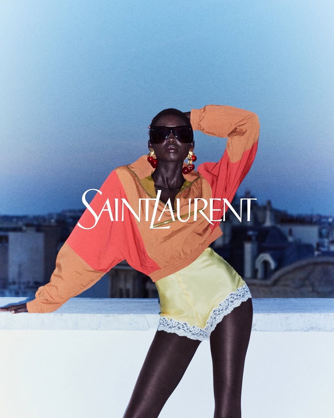
Henrik Purienne shoots the women the way he does best: sun-saturated, slightly voyeuristic, like someone pulled stills out of a memory that might not even be theirs. Frankie Rayder, Erin Wasson, and Jenn Du Puy are not styled as walking logos. They look like they have been living in those clothes for days. Browned skin, softened edges, hair that belongs to actual weather instead of a wind machine. The South of France is there, but not as a postcard. It feels like a place where time has gone loose and the only things that matter are shade, water, and how a strap falls off a shoulder.

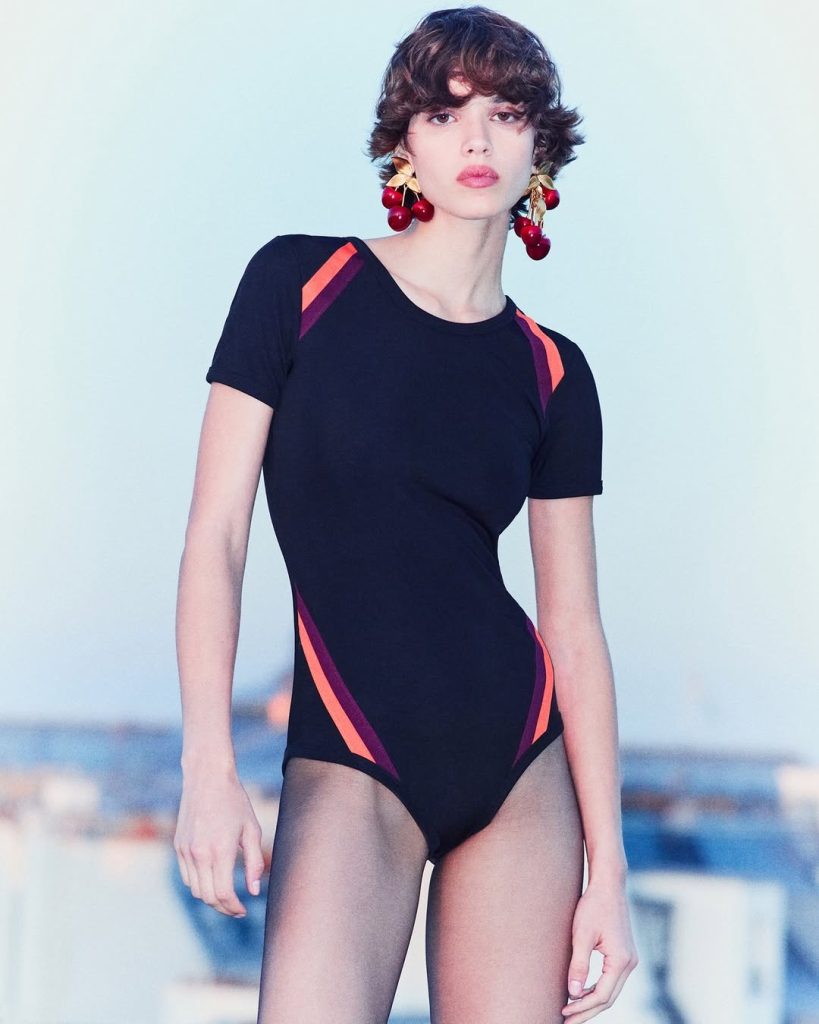
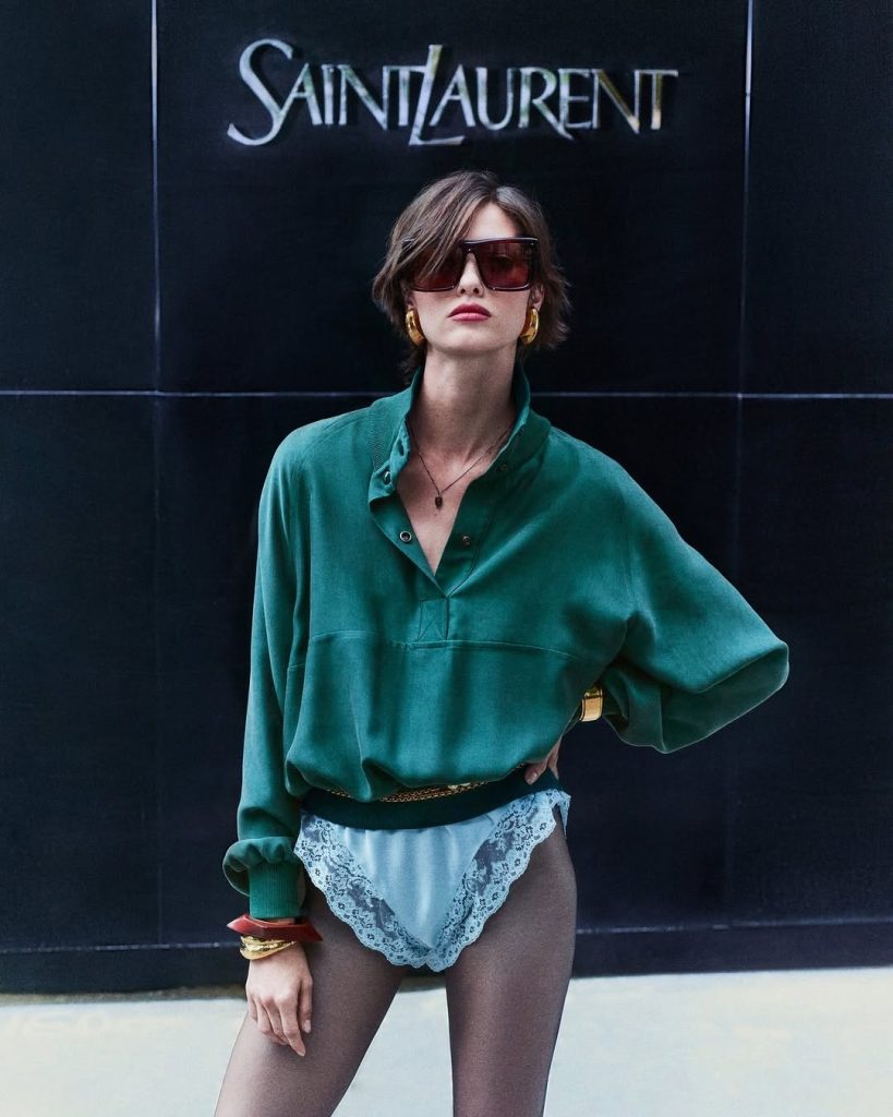
Image Source: Press Office
Most campaigns sell you an idea of “vacation” that looks like a hotel ad. This one sells fatigue, sun, and desire with a side of handbags. It feels honest in a way luxury rarely allows itself to be.

Image Source: Press Office
What interests me is how controlled it is inside that apparent chaos. The clothes are minimal. A bikini line here, a simple dress there, high heels where everyone else would have put sandals. Oversized sunglasses, metal details, signature bags that do not scream; they just sit in the corner of the frame like an inside joke. If you know, you know. If you do not, the ad does not slow down to explain it to you.
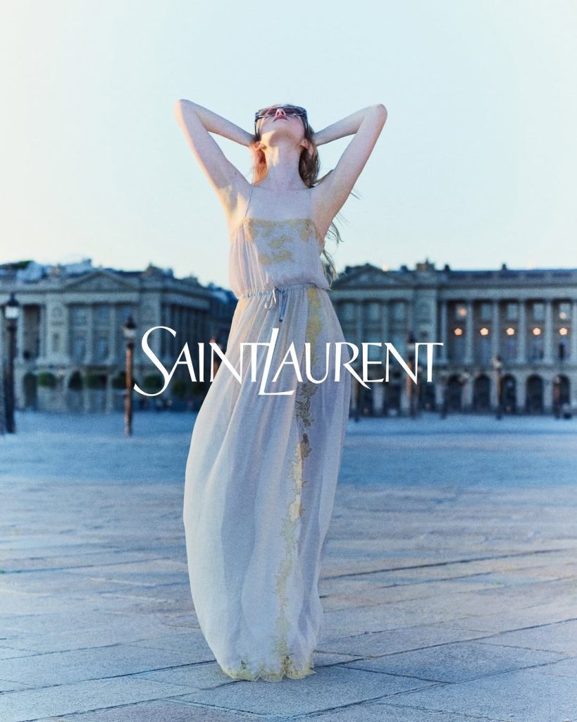
Image Source: Press Office
Vaccarello has always played with tension: coverage and exposure, discipline and temptation. Spring 26 on the runway was about that tight Saint Laurent silhouette pushed to an almost obsessive point. This campaign takes that same energy and lets it sweat a little.
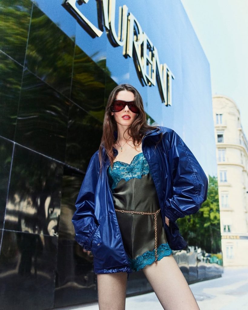
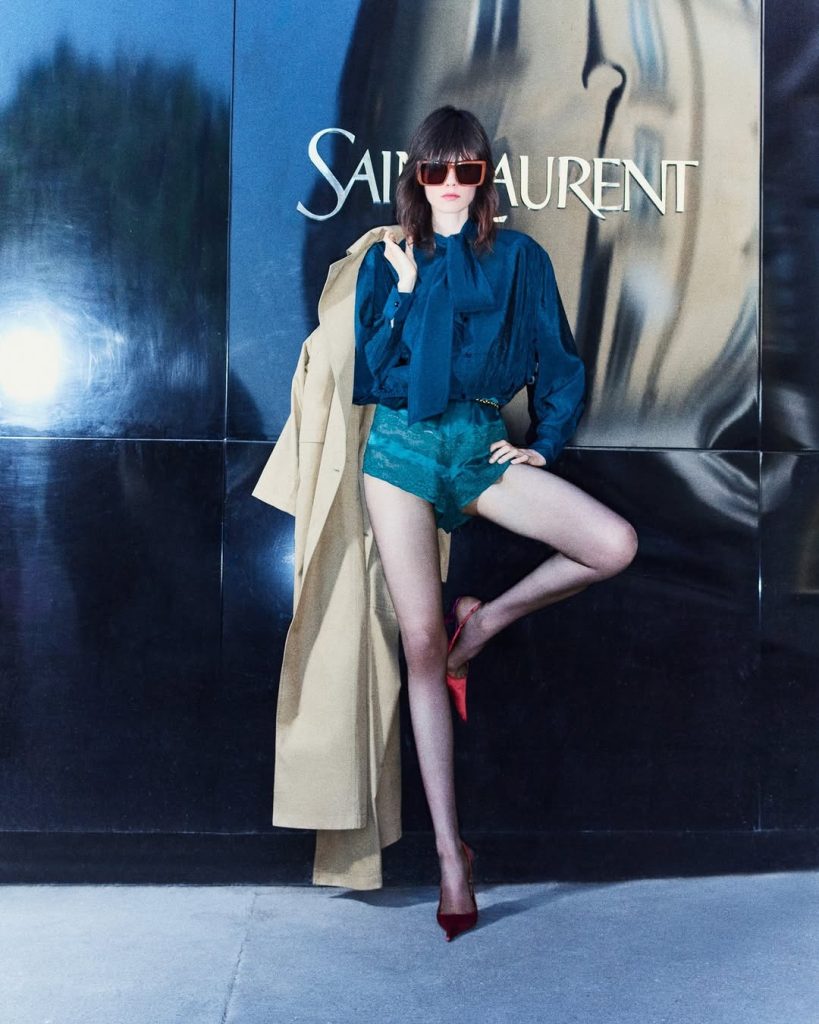
Image Source: Press Office
There is a specific kind of confidence in how it is shot. The images are grainy, almost dirty at moments, like a good song recorded on tape, not streaming. Skin looks like skin. You can feel the heat on the concrete. The women do not look grateful to be there. They look slightly bored, which is a very Saint Laurent emotion. They are not begging for our attention, and that is exactly why they get it.
Source: Press Office
My favorite thing about this whole story is that it refuses to be “relatable.” It is not trying to be your friend. It is not telling you this is “for everyone.” It knows it is selling a fantasy, and it has the decency to make that fantasy specific: a particular coastline, a particular type of woman who has seen enough life not to be impressed by another pair of heels, but will wear them anyway because she understands what they do to a walk.
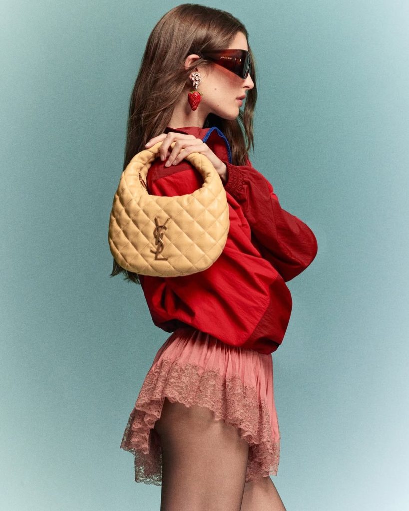
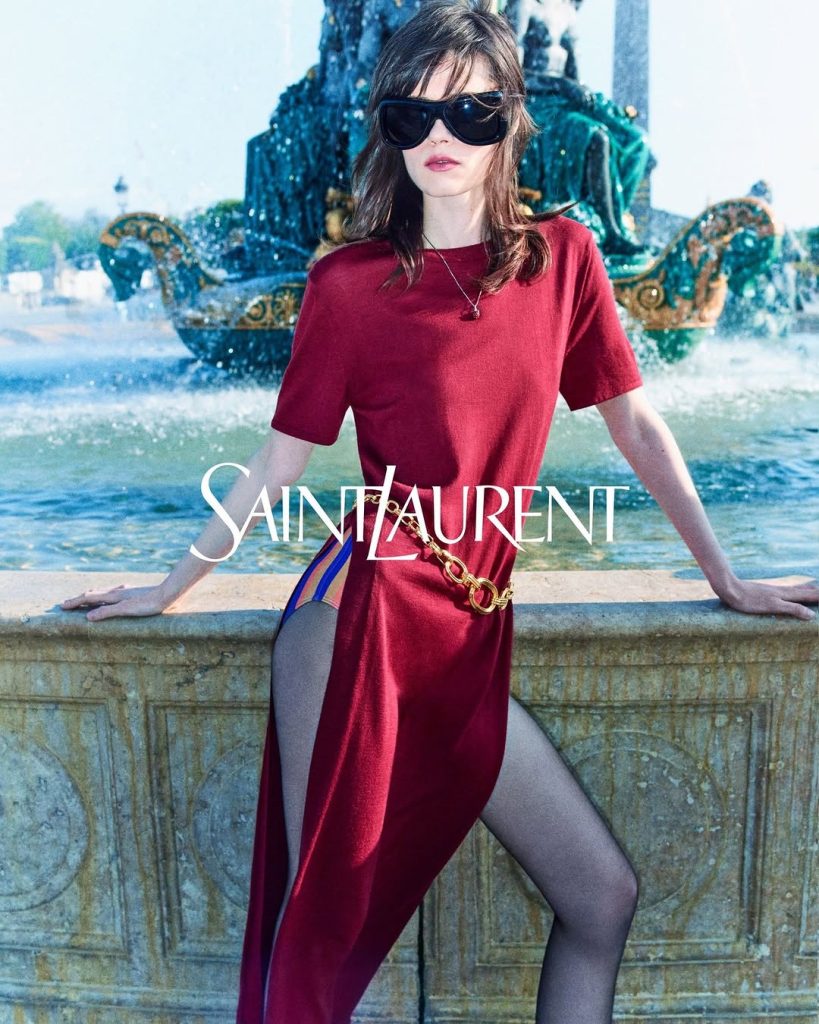
Image Source: Press Office
A lot of luxury houses talk about “mood” now. You can hear the word echoing across creative-direction decks. This campaign actually has one. The mood is: I am hot, I am tired, I am beautiful, and I am not going to move just so you can see the logo better.
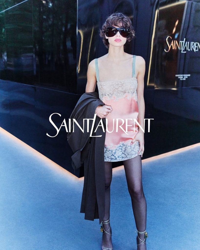
Image Source: Press Office
There is something very modern about the casting too. Rayder and Wasson are not new faces. They carry whole decades of fashion history in their bones. Putting them in the center of the frame, in bodies that are not pretending to be nineteen, is a choice. It says: we are not scared of time. We know what we look like in it. That is a small, important rebellion in an industry that still pretends women vanish the second they turn thirty.
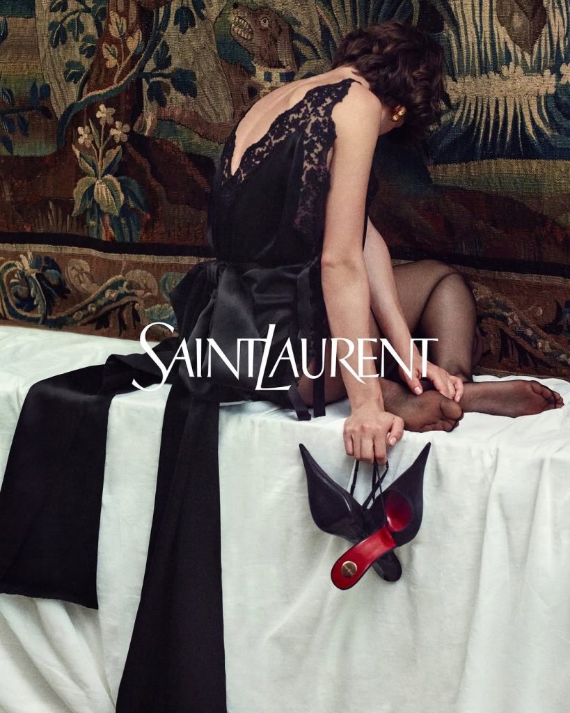
Image Source: Press Office
What makes this campaign incredible to me is not the nudity, or the sun, or even the clothes. It is the clarity. Saint Laurent is not guessing who it is anymore. The Spring 26 collections laid out the shape of that woman and man: serious, sensual, not desperate for approval. The campaign simply shows where those people go when they leave the show space. They go to the coast. They take the tailoring with them. They strip it down and keep the attitude.

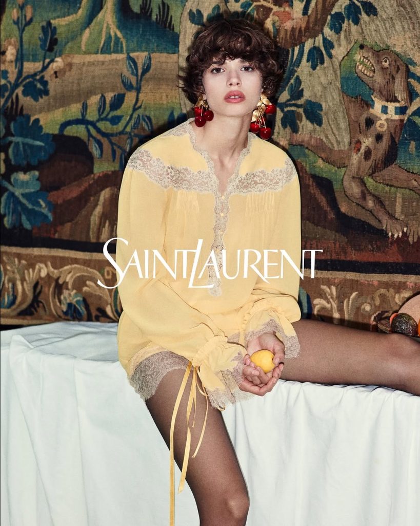
Image Source: Press Office
There is also a quiet alignment happening between the fashion and the larger cultural strategy around Saint Laurent. Vaccarello has been investing in cinema, producing films and working with directors whose work is not exactly light entertainment. The clothes have that same cinematic severity. The campaign feels like a side scene from one of those films, caught between takes, when all the styling is still on but the actors are off duty.
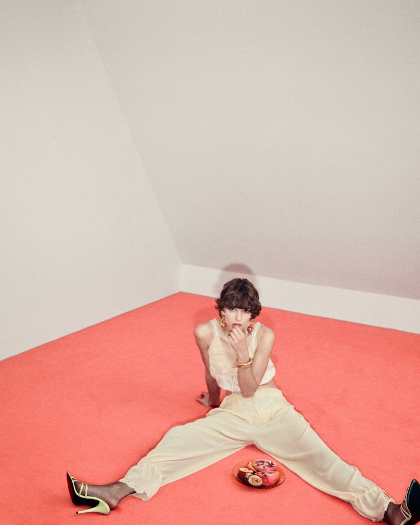
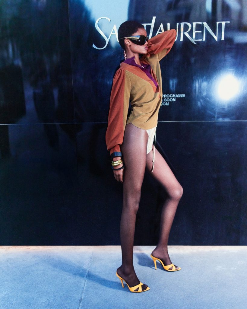
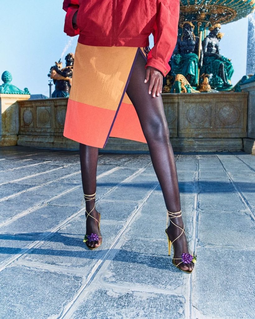
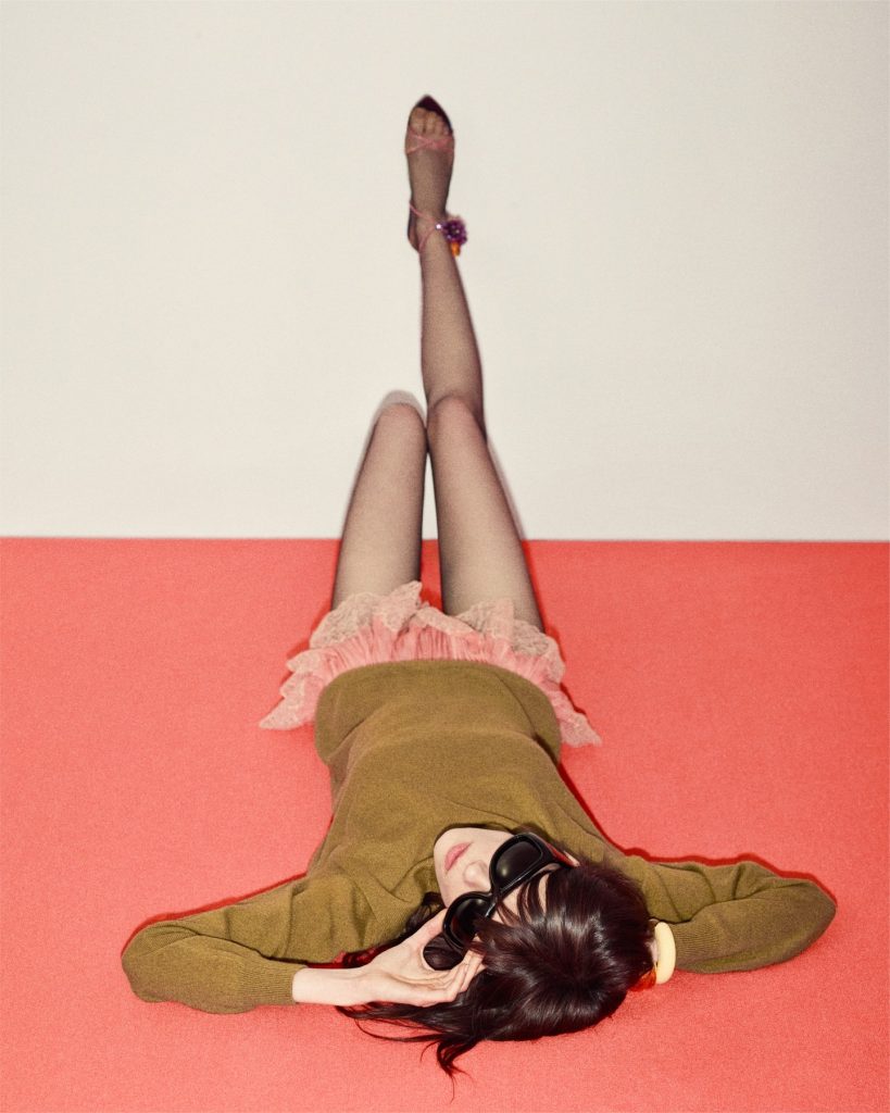
Image Source: Press Office
Most brands are still throwing everything at the algorithm and hoping something, anything, catches a scroll. Saint Laurent is moving in the opposite direction. Edit the silhouette. Edit the casting. Edit the color. Edit the frames. Trust that if you build a world with enough conviction, people will come to you.
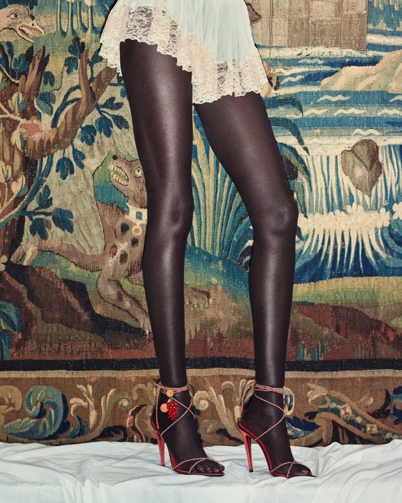
Image Source: Press Office
I look at these images and I do not see “content.” I see a house that has decided what kind of desire it wants to curate, then committed to it all the way. There is a risk in that. Some people will not get it. Some will call it repetitive. But for those who feel at home in that atmosphere, this campaign hits like recognition.
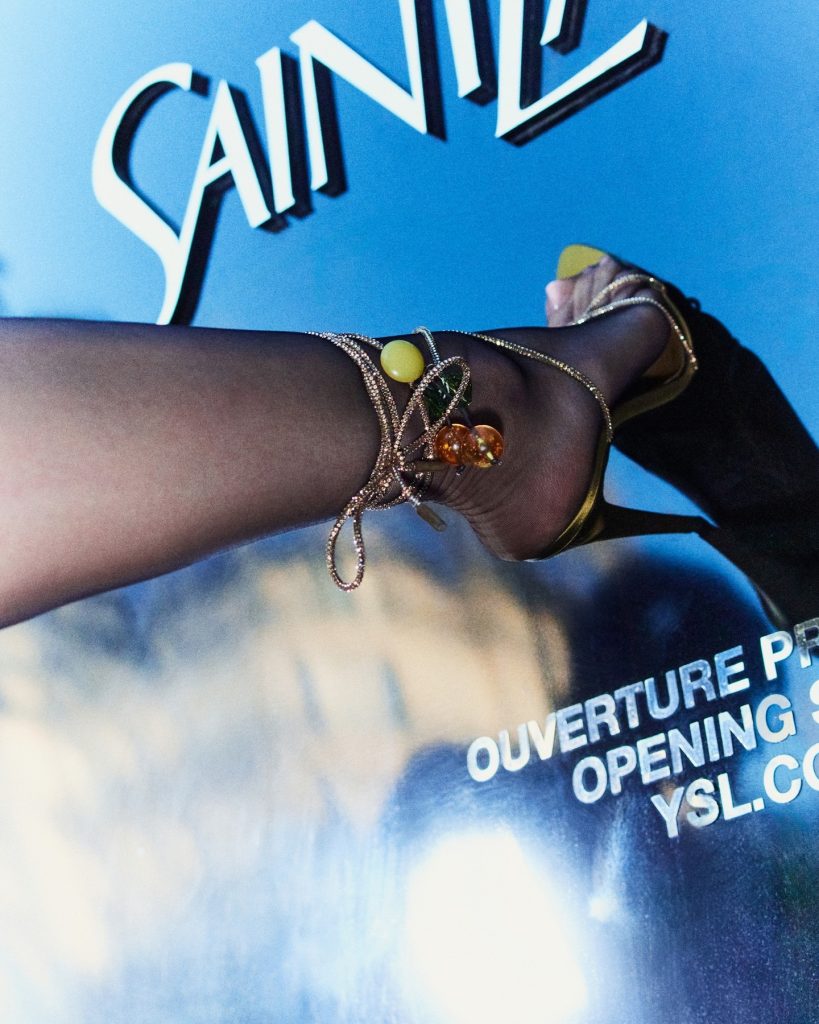
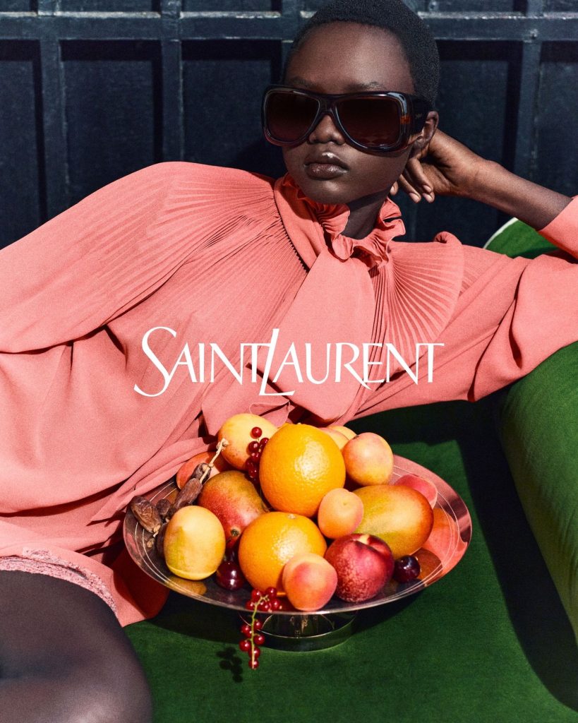
Image Source: Press Office
If you strip away the noise, that is what good luxury communication should do. Not scream at you from a billboard, but tap you on the shoulder and say, quietly: this is your frequency.
Source: Press Office
Spring 26 Saint Laurent has found its frequency. The campaign just turns the volume up.
