Pantone’s Pursuit of Neutrality: the secrets of “Mocha Mousse” as Color of the Year 2025

Every year Pantone selects a Color that reflects the mood and trends of the global culture. Pantone normally considers several factors when selecting the Color of the Year, including:
- Global Events: current events, social movements, and economic shifts can influence the choice. For instance, colors that evoke calmness might be chosen during tumultuous times.
- Fashion and Design Trends: emerging trends in Fashion, Interior Design and Art often play a crucial role in determining the color.
- Technological Advancements: innovations in technology can introduce new palettes and materials that inspire color selection.
- Cultural Influences: cultural shifts and the popularity of certain themes or aesthetics in media and entertainment can also impact Pantone’s decision.
What is certain is that the “Color of the Year” will have a strong impact on the choices of various industries as mentioned.
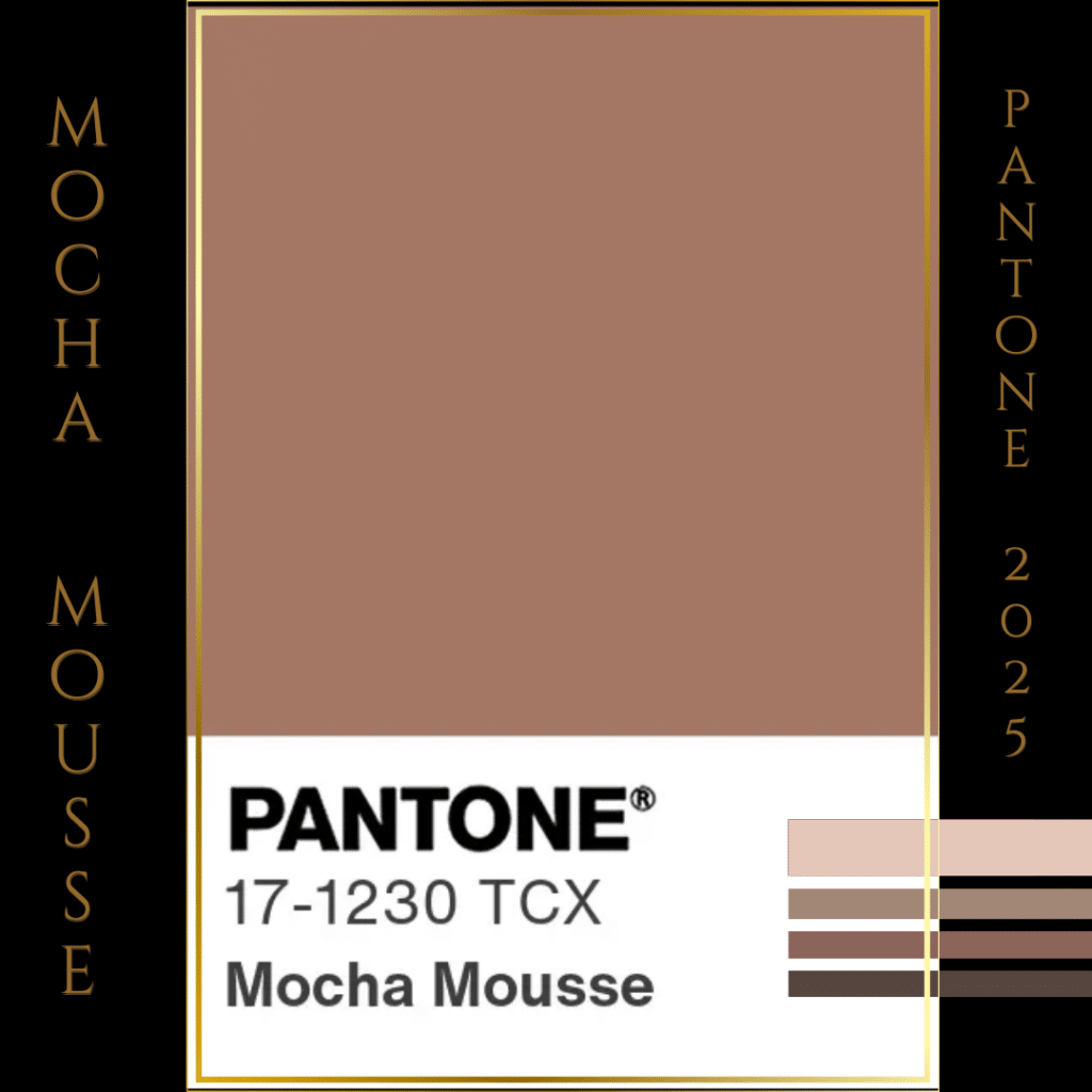
Mocha Mousse, 2025 Pantone’s Color Of The Year
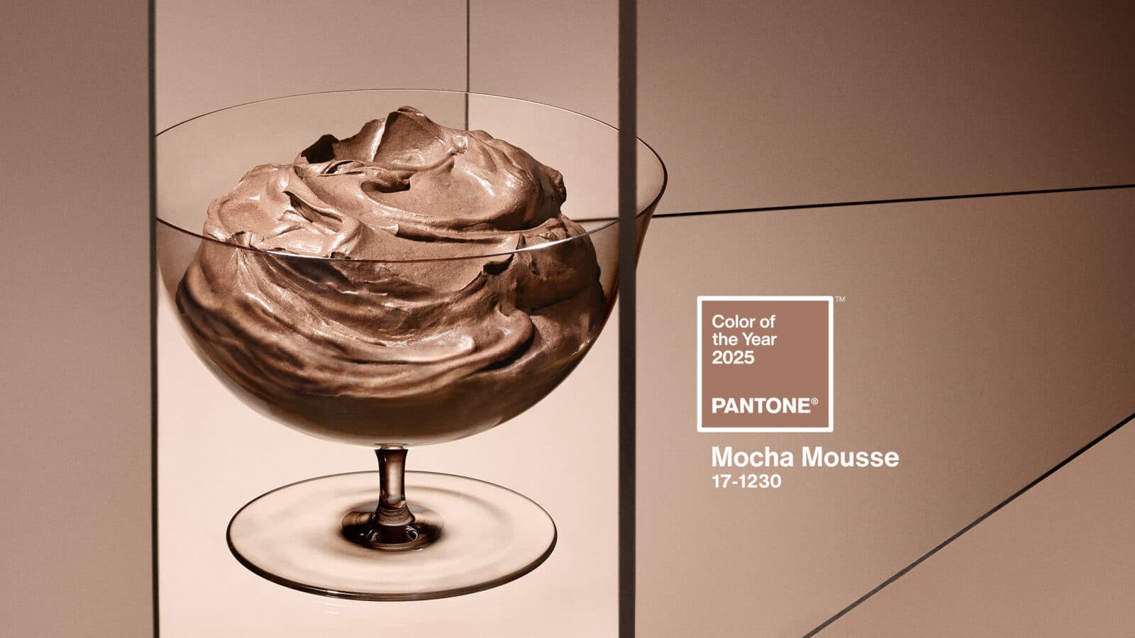
Mocha Mousse has recently been declared Color of the Year 2025: “Mocha Mousse“- according to Pantone – is an “evocative soft brown”, evoking the delectable shades of coffee and chocolate, “a mellow brown infused with a sensorial and comforting warmth”. “A warming brown hue imbued with an inherent richness that nurtures with its suggestion of the delectable quality of cacao, chocolate and coffee, appealing to our desire for comfort”.
What in fact appears evident is that Pantone has confirmed the theme of neutrality we extensively talked about in Gazetta’s December issue. As we pointed out, this trend reflects a broader cultural desire to pause and savor the world around us, offering a sense of calm and balance in a fast-paced environment.
The Versatility of Mocha Mousse
Mocha Mousse is a beautiful neutral shade that is both versatile and universally appealing. Akin to beige, Mocha Mousse is a metameric color, meaning it can appear differently under various lighting conditions or based on the color of the background. This characteristic enhances its adaptability across different contexts, making it a popular choice especially within Fashion and Interiors.
Mocha Mousse in Fashion and Personal Styling
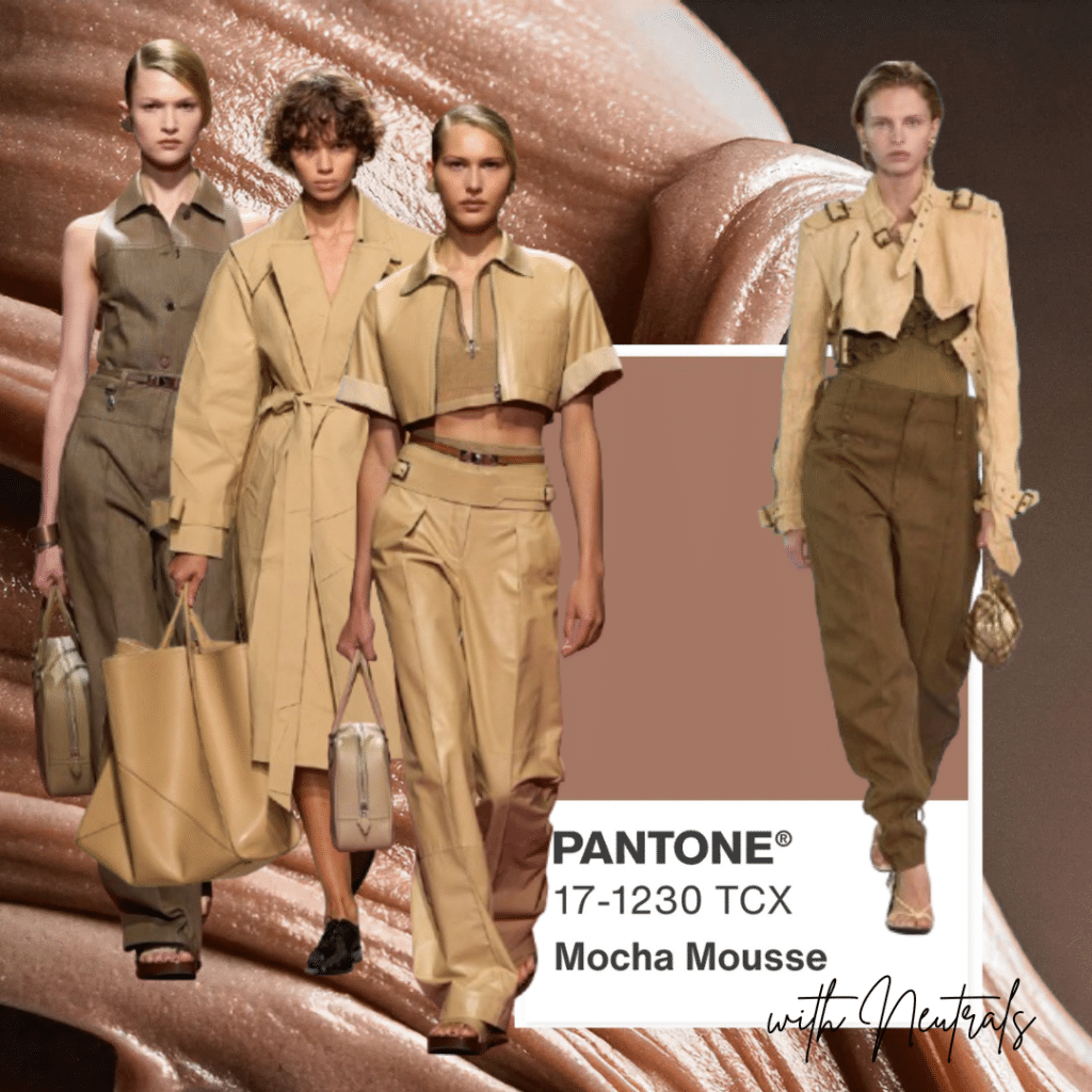
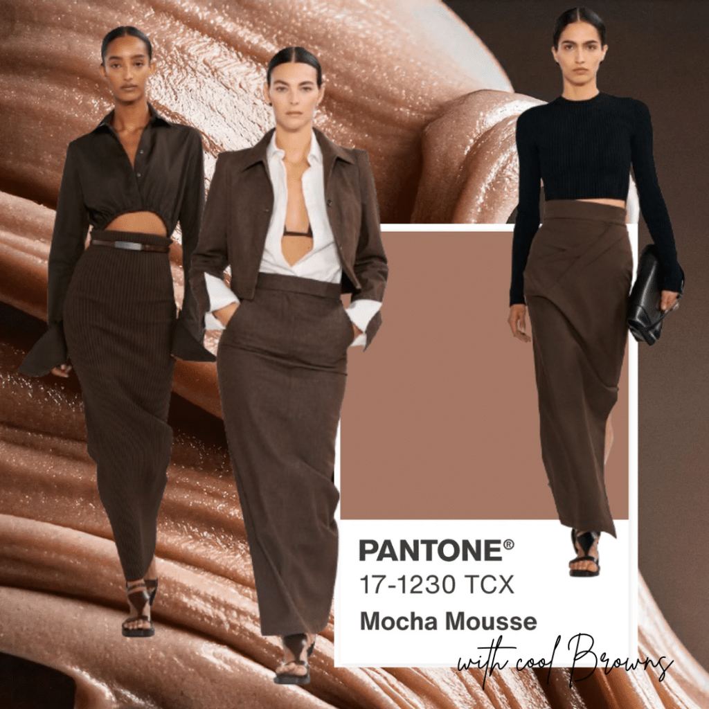
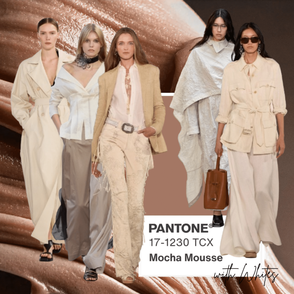
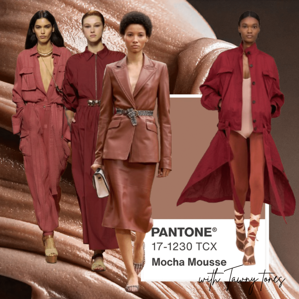
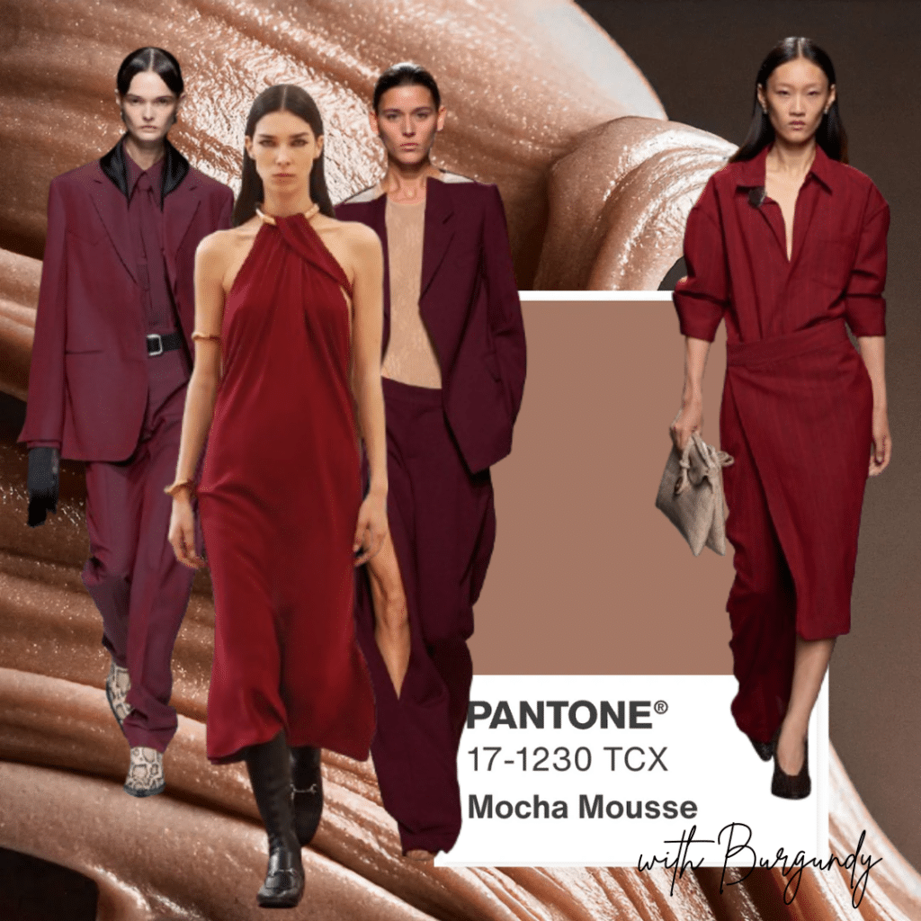
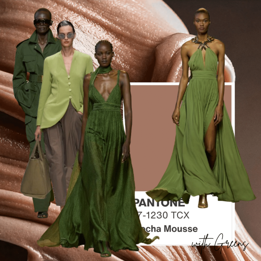
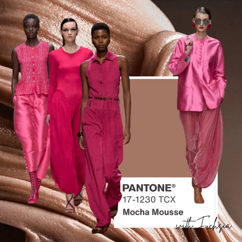
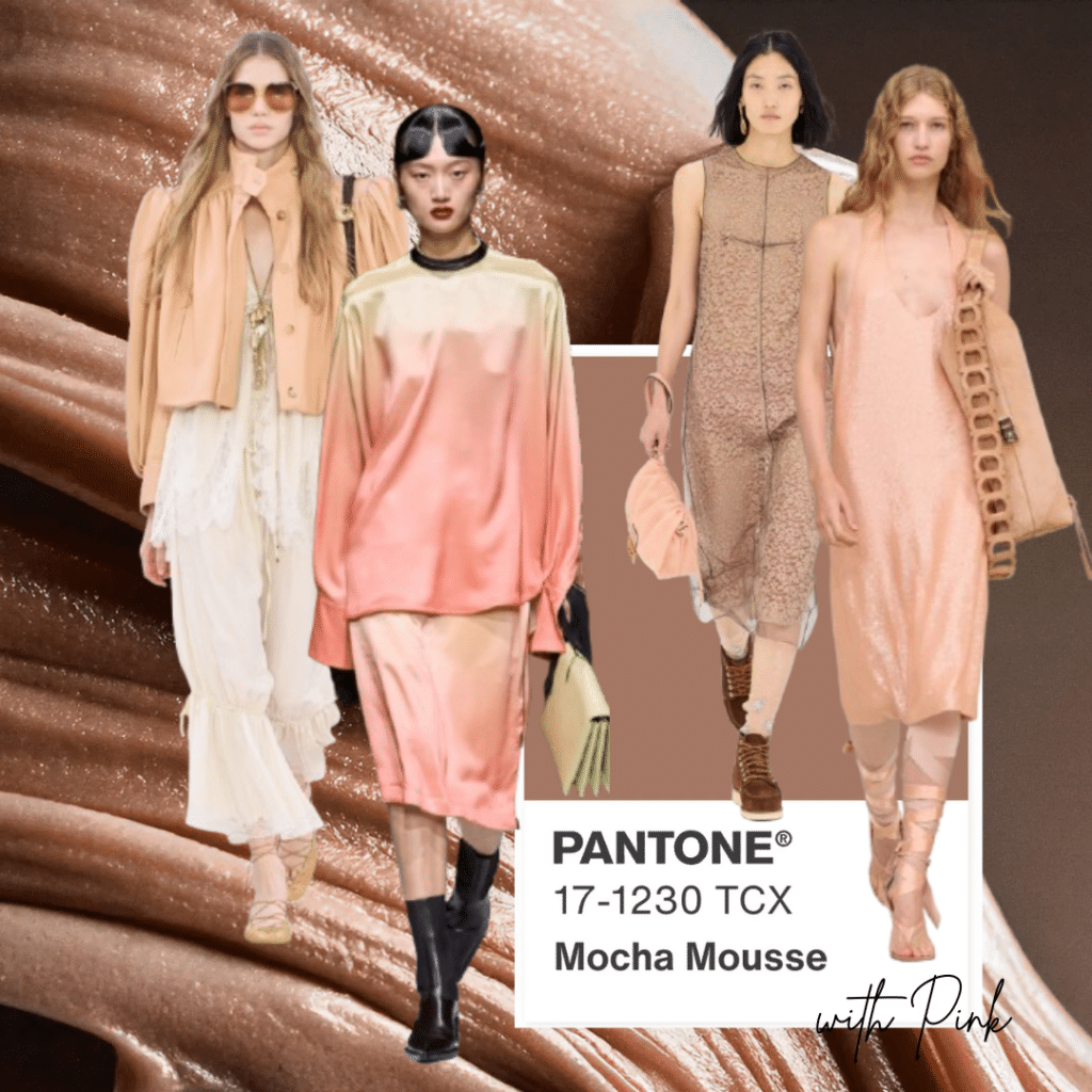
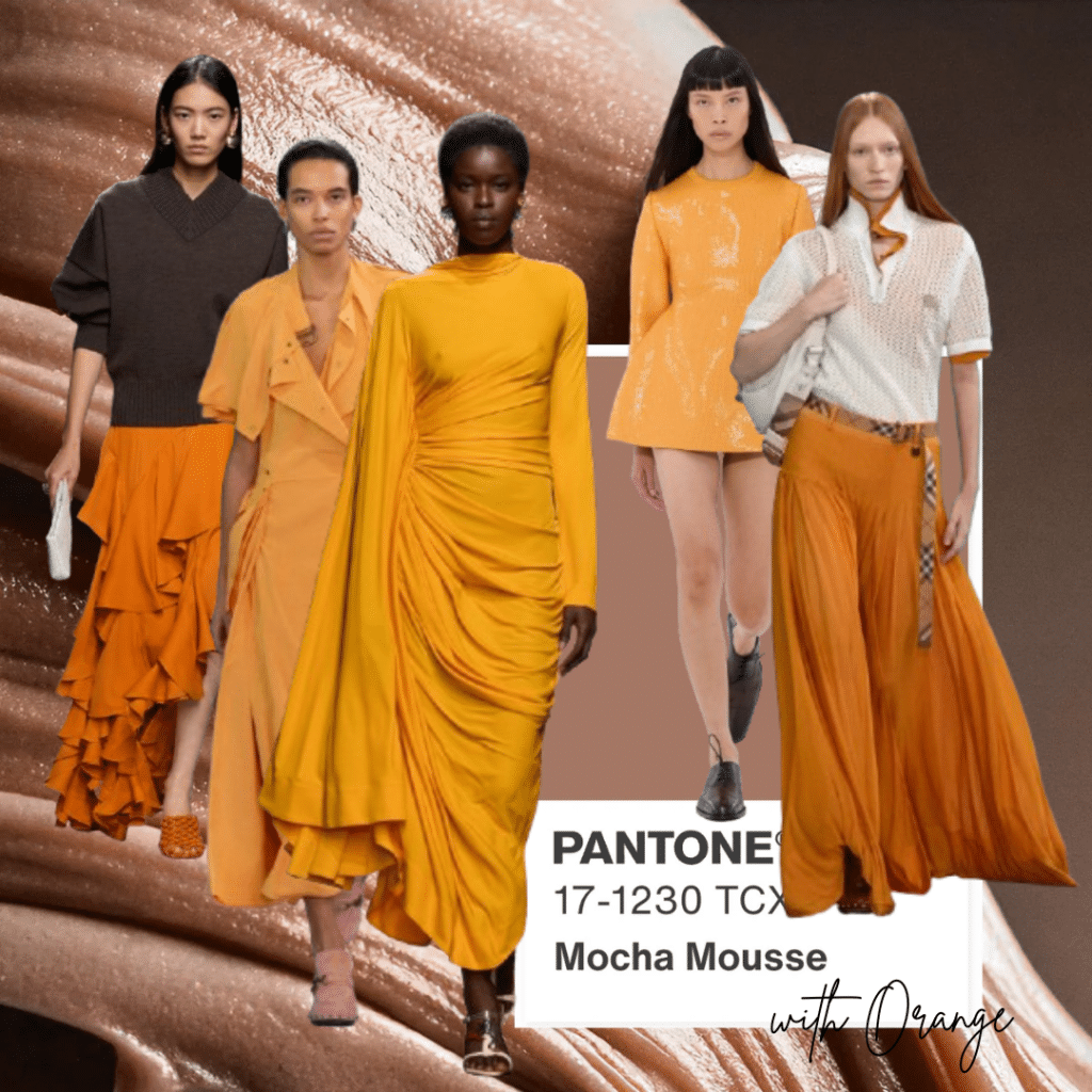
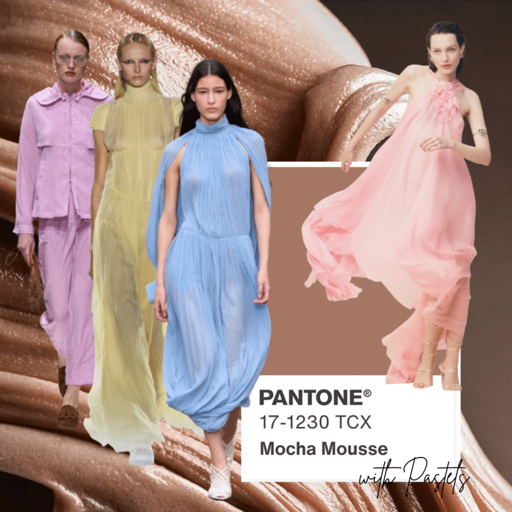
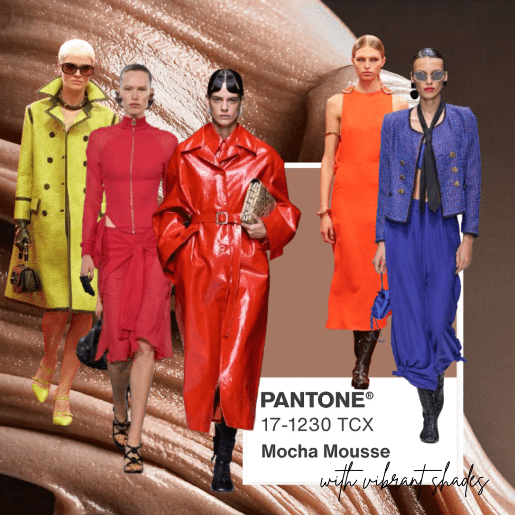
Trend Layout & Design by Dr. Manuela Pirola; Image Source: Vogue
In the realm of Fashion and Personal Styling, Mocha Mousse is celebrated first and foremost for its versatility and warmth. It serves as an excellent base color, easily paired with tone-on-tone hues, pastel colors or earthy and tawny shades. The subtlety of beige provides a sophisticated backdrop also for more vibrant colors, thus creating a balanced and harmonious look. When paired with green or burgundy tones, Mocha Mousse becomes simply awe-inspiring. Last but not least, the combo Mocha Mousse and (medium dark) pink tones exalts the pinkish undertone of Pantone’s Color, thus conveying a warm “retro-style” feeling. For sure, the adaptability of Mocha Mousse allows for a wide range of styling options, making it a staple in everyone’s wardrobes.
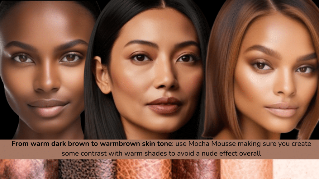
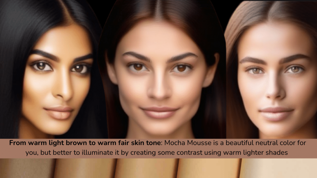
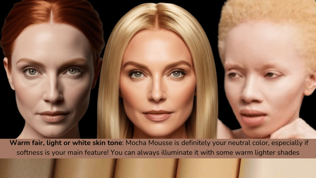
Seasonal Color Analysis & Skin Tones by Dr. Manuela Pirola
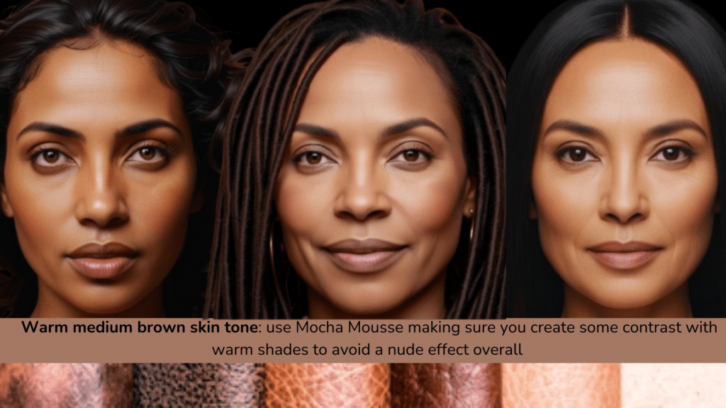
Within Seasonal Color Analysis (the universally known method used to determine which colors best complement an individual’s natural features, such as skin tone, eye color and hair color), Mocha Mousse is particularly suitable for Warm and Soft categories, hence Soft Autumns and Soft Springs primarily, but also some “muted” types like Soft Summers. This is especially true for Caucasian individuals, as Mocha Mousse works beautifully as a “neutral” shade on light skin tones. On dark skins, instead, Pantone Color of the Year 25 becomes a “nude” shade, so it is important to create some contrast with other hues in order to avoid the “nude effect” overall. Likewise, Mocha Mousse should be used sparingly if you belong to Winter or Spring seasonal categories, as it would not enhance your chromatic features, both on light and dark skin tones. In case you are fond of this color and want to wear it, try paring it with some hues present in your “seasonal palette”, which will be cool, mostly dark and vibrant for Winter types and warm, mostly light and bright for Spring typologies. If you like a tone-on-tone effect, then try combining different textures to create a contrasted effect.
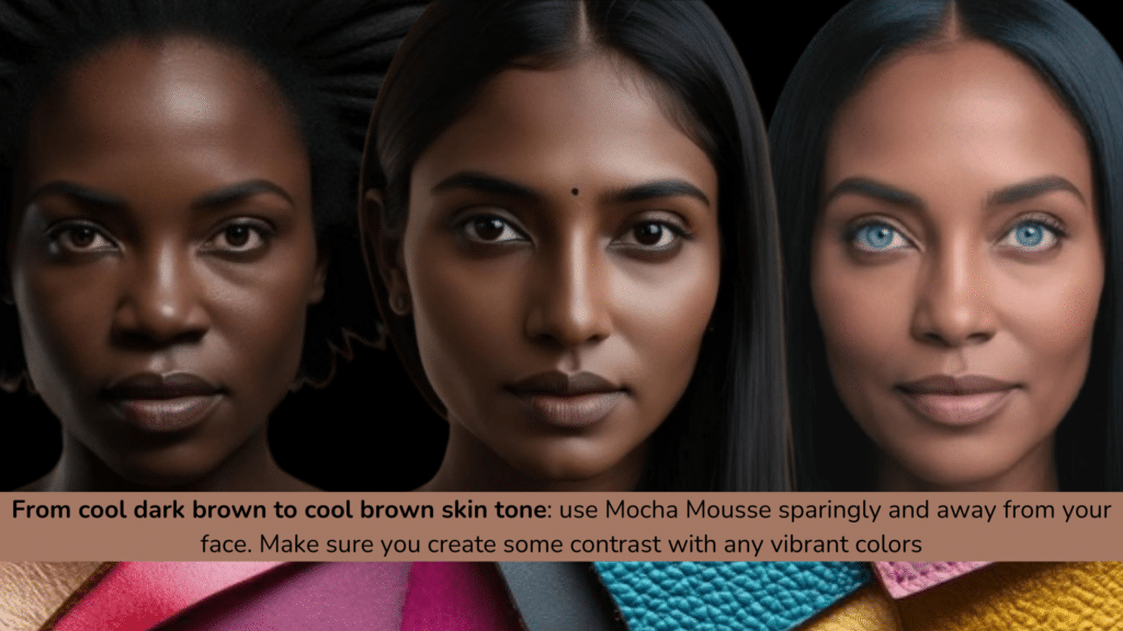
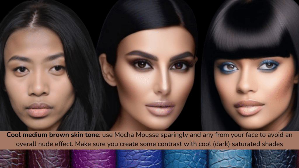


Seasonal Color Analysis & Skin Tones by Dr. Manuela Pirola
Mocha Mousse in Interior Design
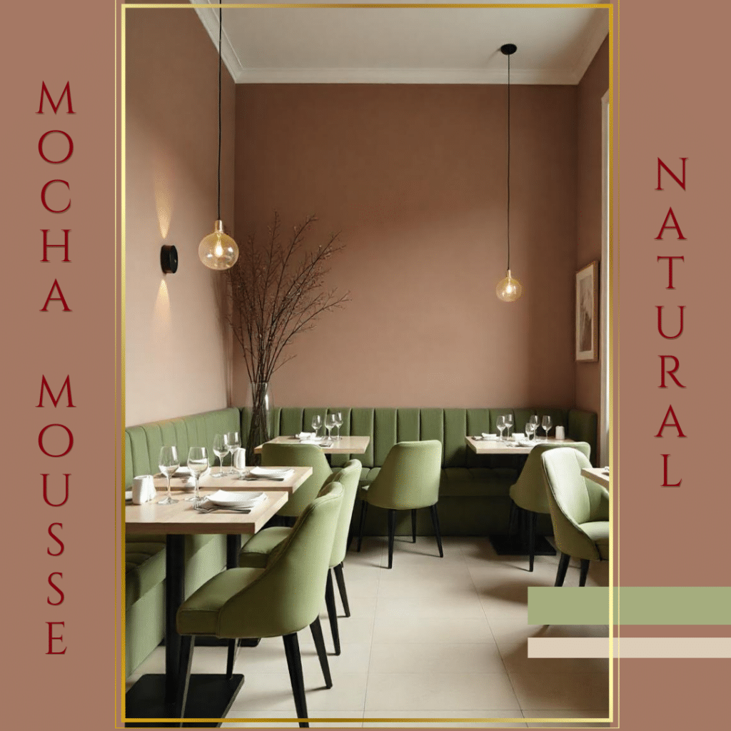
Interior Layout by Dr. Manuela Pirola
When it comes to Interior Design, our emotional perception of Mocha Mousse is heavily influenced by the chromatic palette it is paired with. Beige shades normally conjure up feelings of warmth and comfort when combined with other neutrals, like white, taupe and greige nuances, along with rich, earthy tones; or it can create a sleek, rich atmosphere when used alongside more vibrant or piquant shades. Broadly speaking, we can say that Mocha Mousse’s neutrality offers a canvas that can be tailored to individual tastes and preferences, making it a favored choice for designers aiming to create versatile and timeless spaces.
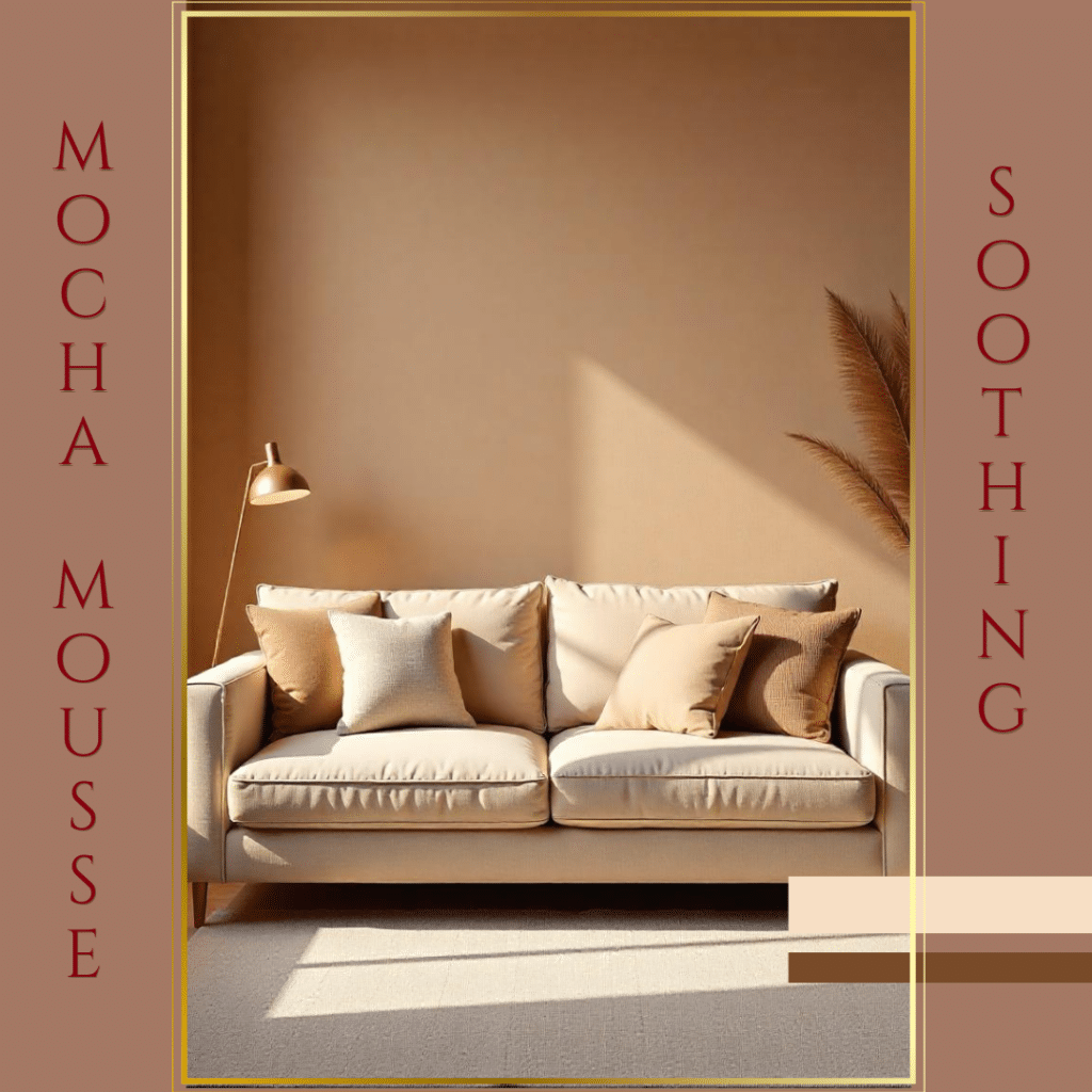
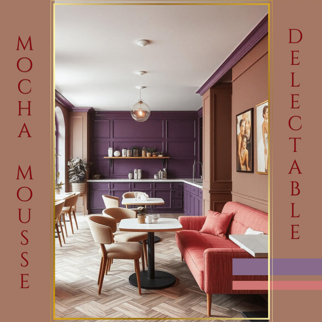
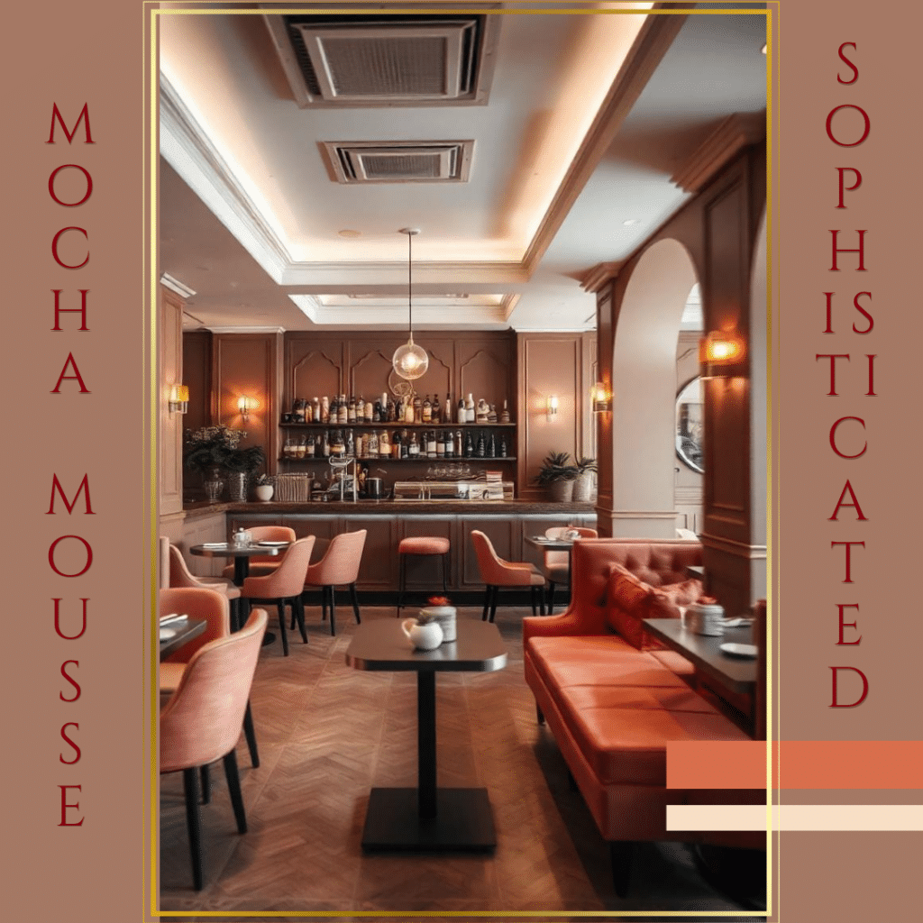
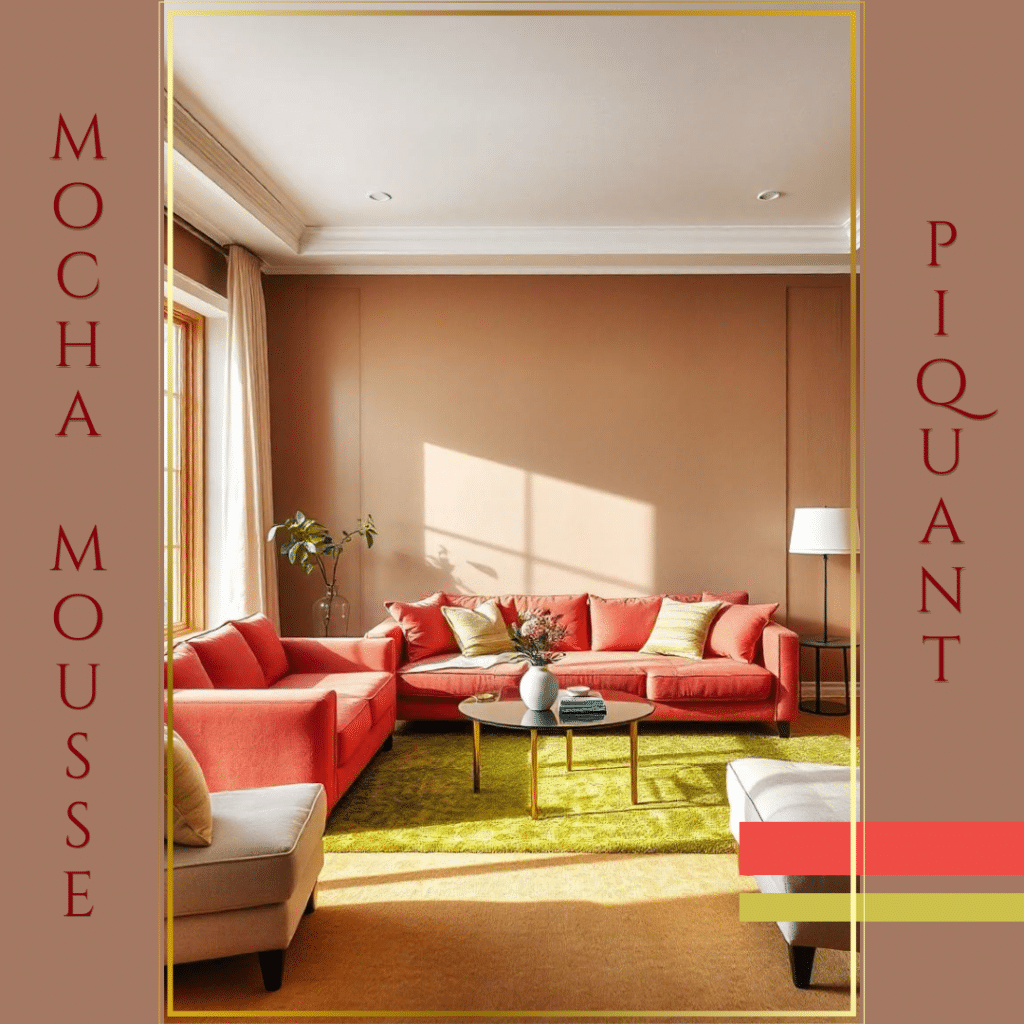
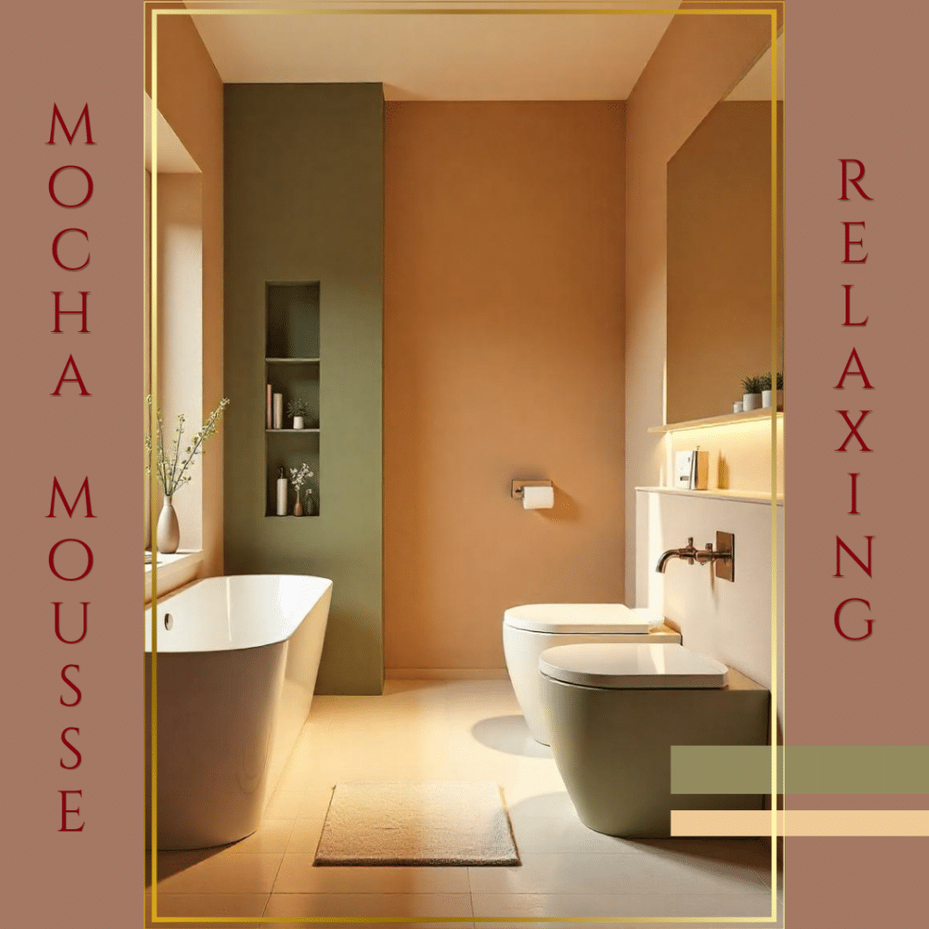
Interior Layouts by Dr. Manuela Pirola
No doubt the adoption of neutral colors like Mocha Mousse, especially in Fashion, Interior Design and Marketing, underscores a growing desire for simplicity and versatility. Not only does this shade offer a neutral backdrop for personal expression in different contexts, but it also enhances our ability to connect with and appreciate the world around us, in a pleasant and soothing mood. As this trend continues to evolve, it highlights the balance between functionality and aesthetic appeal, resonating with those seeking harmony within their environments.


