
Living in Color



Perhaps color was never meant to exist on a surface. Perhaps it was always meant to move with us, shaping the way we inhabit a room, a city and, sometimes, even ourselves. Long before it found its way into wardrobes or galleries, it lived in places that refused to be forgotten—the warmth of sunlit walls, the rhythm of painted streets and the quiet confidence of architecture that understood color as emotion rather than decoration.
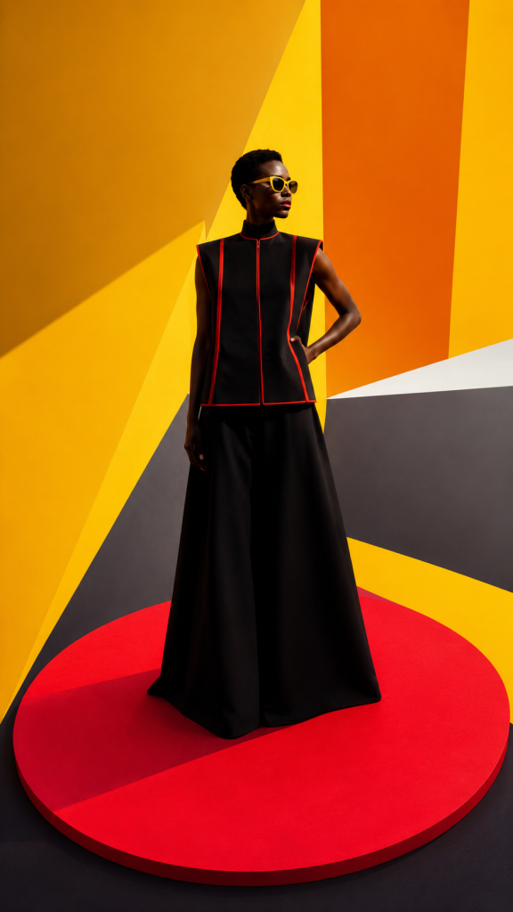
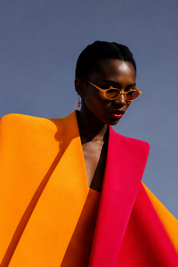
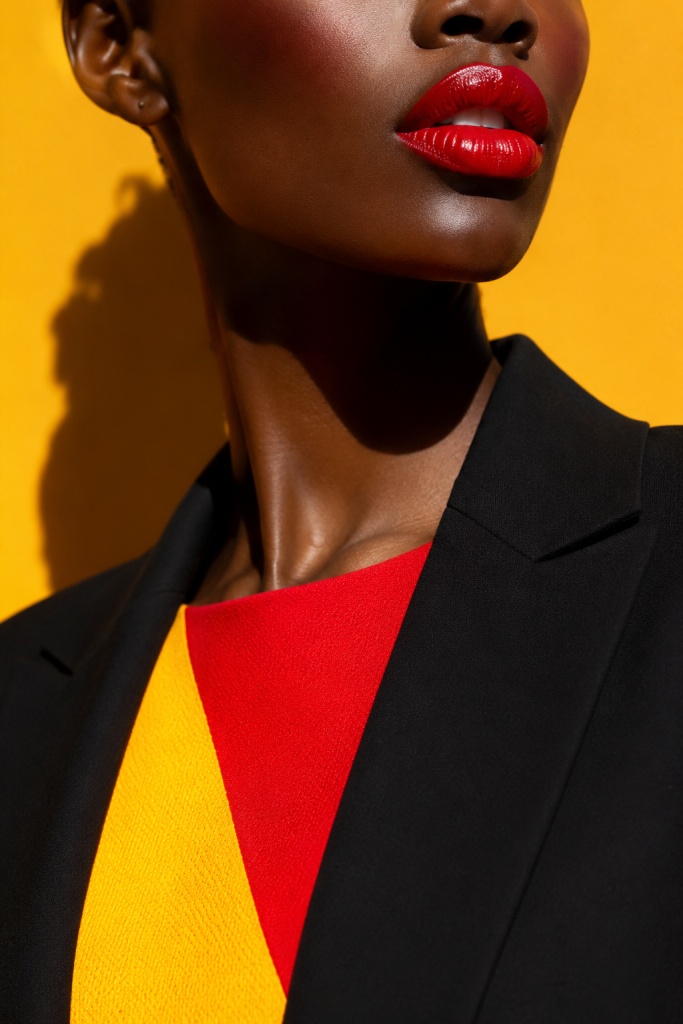
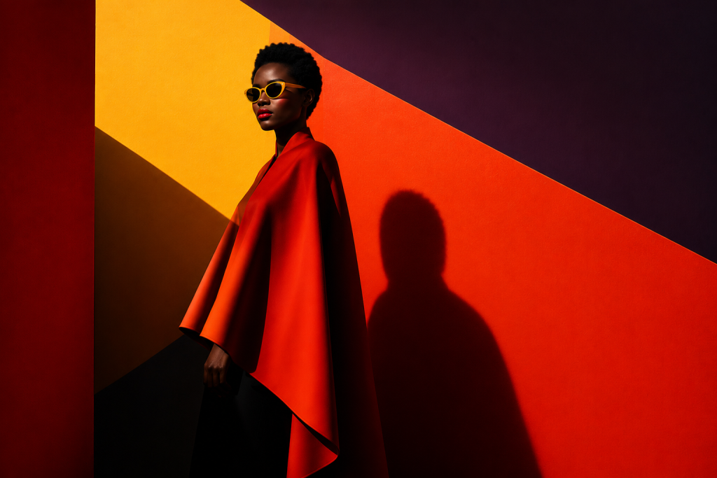
At the centre of this story stands a woman who never competes with her surroundings; she completes them. Wrapped in sculptural silhouettes and surrounded by bold planes of crimson, ochre, charcoal and sunlit yellow, she becomes part of the composition itself, dissolving the boundary between fashion, architecture and art. She isn’t framed by the geometry around her; she gives it scale, softness and presence, reminding us that spaces are ultimately brought to life by the people who inhabit them.
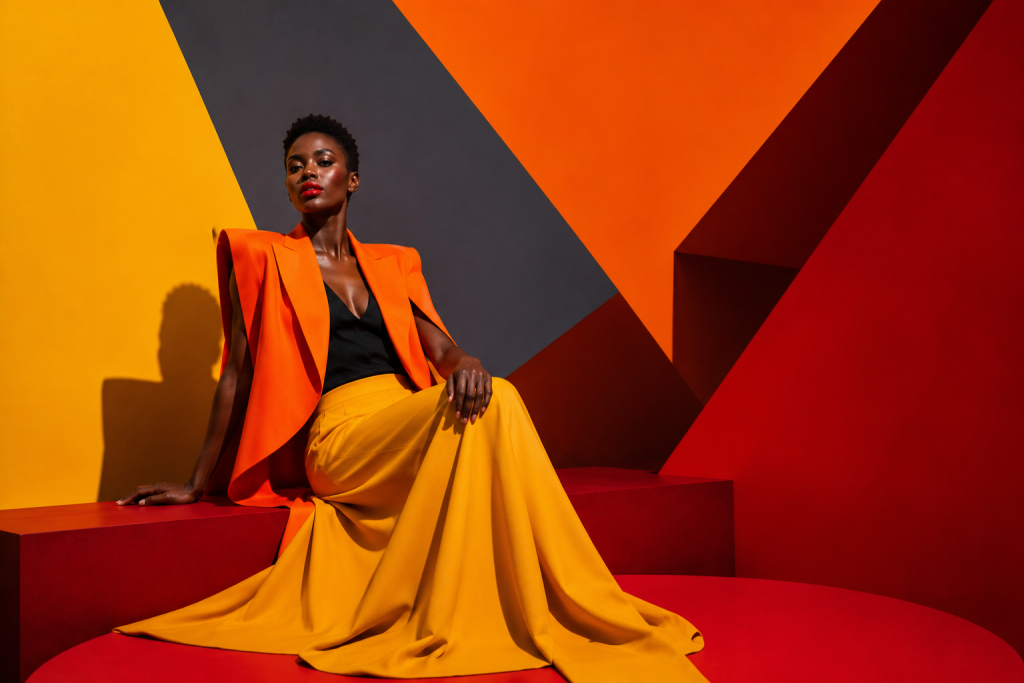
The visual language draws inspiration from the architectural mastery of Luis Barragán, whose fearless use of color transformed walls into feeling, and the joyful experimentation of Memphis Milano, where geometry became both playful and profound. Here, sharp lines soften around the human form, saturated planes become stages for movement and stillness alike, and every composition invites the eye to wander just a little longer.
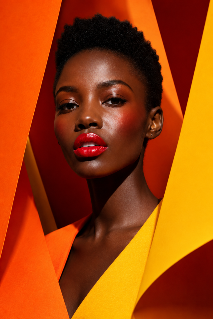
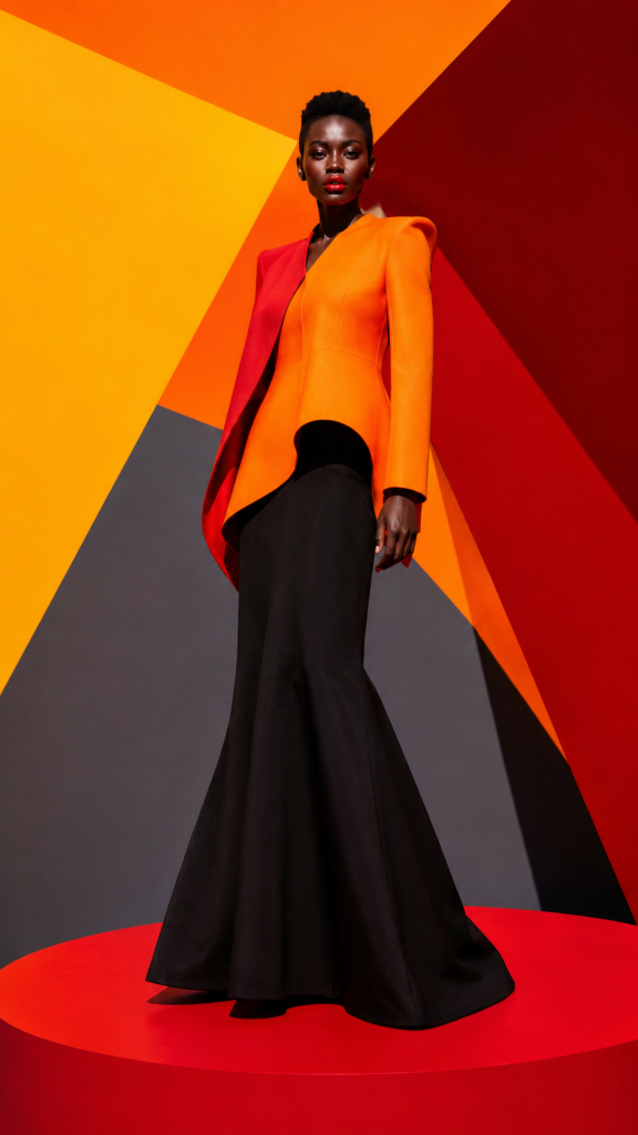
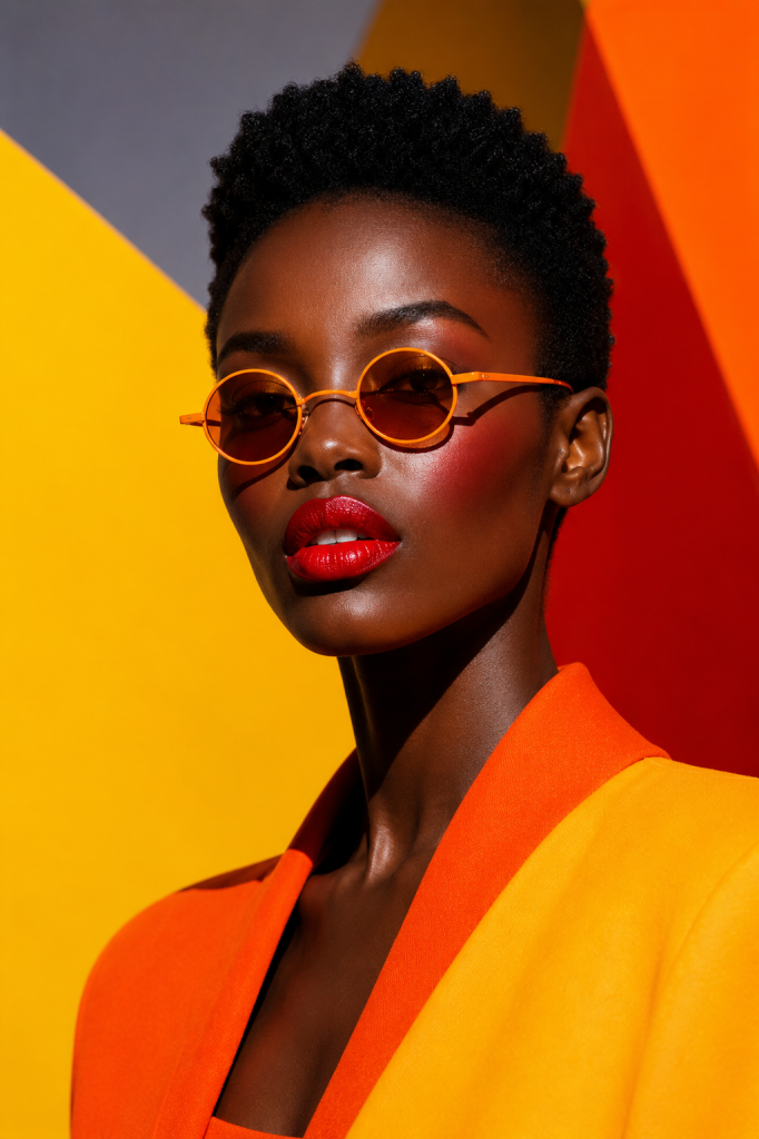
Living in Color isn’t interested in telling us what to wear. It asks something far more enduring: what changes when we stop treating color as an accent and begin embracing it as a way of seeing? Perhaps beauty has always lived somewhere between light and shadow, structure and softness, restraint and abundance, waiting for someone willing to notice.
Creative Direction: Dina Yassin

Photography & AI Visualization: AI-Genrated by ChatGPT for Gazetta
What's Your Reaction?

